There are many aspects of creating a website design. Web designers often have to play multiple roles and be very knowledgeable about building effective and usable site layouts. Most of the lessons you’ll learn in web design come from work experience; learning is an iterative process and there is no better way to gain knowledge than to make mistakes (and then and learning from them).
1. Optimize Web Graphics for Better Page Load Times
Learn how to optimize your web graphics by selecting the proper format and making sure that it’s as small as it can possibly be. Even though people are advancing to broadband connections, there are still quite a few who use dial-up internet connections. Additionally, with the emergence of mobile device technologies that don’t necessarily have broadband-like speeds, having slow page load times due to image file sizes can turn users off.
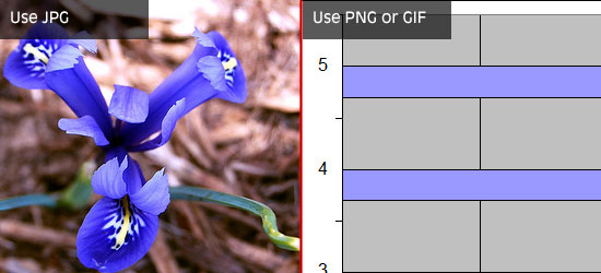
Here is a general rule of thumb for picking the right file format: images that have solid colors are best saved as PNGs and GIFs, while images with continuous colors (such as photographs) are best saved as JPGs.
There are plenty of tools available at your disposal that will help you further optimize your images and lower their file sizes, check out this list of tools for optimizing your images.
By limiting the number of images you use to the bare minimum, being smart about using images and reducing file sizes as best as you can, you will significantly cut down page response times of a web page and improve your web page performance.
2. Keep it Clean and Simple
A good web design is not just one that looks visually appealing, but also one that is user-friendly. A clean and simple web design typically ends up being a high-usability web design that is not confusing to interact with.
By having too many site features and components on a page, you risk the chance of distracting website viewers from the purpose of the website. Make sure each page element has a purpose and ask yourself the following questions:
Does the design really need this?
What does this element do and how does it help the user?
If I remove this element all of a sudden, will most people want it back?
How does this element tie into the goal, message, and purpose of the site?
Additionally, though it may be super awesome to come up with a new concept or interface design pattern for your website, make sure that the design is still accessible and intuitive to your users. People are accustomed to common interaction patterns, site features, and web interfaces – and if your design is truly unique, make sure it’s not too obscure and puzzling. Be creative, but also keep it simple.
3. Navigation is the Most Important Thing You Will Design
The most essential site feature is the website’s navigation — without it, users are stuck whatever page they happen to land on. With that obvious fact out of the way, we’ll talk about some important points to consider when constructing a navigation scheme.
First, it’s very important to put enough time and a lot of planning on a site’s navigation structure. This is common sense, but it’s still surprising how many web designs take site navigation for granted.
Placement, style, technology (will it use JavaScript or just CSS?), usability, and web accessibility are just some of the things you need to consider when creating the navigation design.
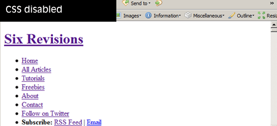
Your navigation design should work without CSS because of text-based browsers. Poke fun of text browsers all you want, but they are still prevalent in many mobile devices. Perhaps more importantly, navigation that works with CSS disabled is accessible (99.99% of the time) via screen readers.
Navigation should be accessible and usable without the need for client-side technologies such as JavaScript or Flash, which users may not have enabled or installed for various reasons such as security or company policy.
It is imperative that you have a good navigation system in place that is located at a highly-visible location. A good navigation is detectable as soon as the web page loads without having to scroll down the web page. This is where keeping it clean and simple plays a major role: a complex and unconventional design can lead to user confusion.
Users must never wonder, even for a split second, “Where is the site navigation?”
For sites organized in a hierarchical, multi-level manner, make sure that it is easy to navigate from between parent and child web pages. In addition, it should be easy to reach top-level pages (such as the site’s front page) from any webpage.
The main goal of your site navigation is to allow users to get to their desired content with as few actions and with as little effort on their behalf as possible.
4. Use Fonts Wisely and Methodically
Though there are thousands of fonts out there, you can really only use a handful (at least until CSS3 is fully supported by major browsers). Make it a point to stick to web-safe fonts. If you don’t like web-safe fonts, consider a progressively-enhanced web design that leverages sIFR or Cufon.
Keep font usage consistent. Make sure that headings are visually-different from paragraph text. Use white space, tweak line-height, font-size, and letter-spacing properties to make content pleasant to read and effortlessly scannable.
Perhaps one of the things that web designers often get wrong is font-sizes. Because we want to fit as much text as we can in a web page, we sometimes set font sizes to uncomfortably small sizes. Try to keep font sizes at and above 12px if possible, especially for paragraph text. While many people face no difficulty reading small text sizes, think about older users and persons with low-vision and other types of vision impairment.
5. Understand Color Accessibility
After talking about fonts, we also need to point out the importance of using the right colors.
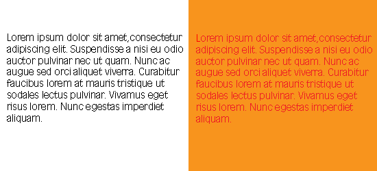
You need to consider color contrast of background and foreground colors for readability and for users with low-vision. For instance, black text on white background has a high-contrast, while orange text on red background will make you strain your eyes.
Also, use colors that are accessible to users with particular forms of color-blindness (check out a tool called Vischeck that will help you test for certain types of color-blindness).
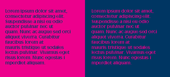
Some color combinations work well only when the color is used as a foreground color instead of a background color. Take for example, dark blue text on a pink background versus but pink text on blue background, same colors but different levels of readability and reading comfort. It is important not only to get a good color combination but also to apply it to the right elements on the page.
6. You Need to Know How to Write Code Yourself
With various WYSIWYG editors flooding the market, it has become as simple as 1-2-3 to design a site. However, most of these editors insert unnecessarily code junk, making your HTML structure poorly designed, harder to maintain and update, and causing your file sizes to bloat.
By writing the code yourself, you come out with clean, crisp, and terse code that’s a pleasure to read and maintain; code that you can be proud to call your own.
Knowing how to use a WYSIWYG or an IDE with a visual preview does not excuse you from learning HTML and CSS. You have to know what’s going on in order to create effective, semantic, and highly-optimized web designs.
7. Don’t Forget Search Engine Optimization
A good designer should always remember to keep the basics of SEO in mind when designing a site. For example, structuring web content so that important text are represented as headings (i.e. page title and logo). This is where learning how to code properly comes in handy. Knowing correct, semantic, and standards-based HTML/CSS – you will quickly realize that divs are better than tables for web layouts not only for accurate representation of site content, but also for search engine rankings; you will also know that CSS background text image replacement is a good idea.
8. Understand that People are Impatient
People on an average spend only a few seconds before deciding whether they want to read more or navigate away to another site. Therefore, you as a web designer have to device a way for encouraging users to choose the former option within those precious seconds.
Know that not many visitors will scroll down to view the entire contents of the page if what they see at the top does not interest them. Remember to keep your important elements on the top where they are easily visible, but also do not overcrowd the top half of the page which can intimidate users and turn them off from reading further down the page. Consider the top half of a web design a selling point: be a salesman, make people buy into the notion that they want to see what else is on your site.
9. Learn About (and Be Aware of) Browser Quirks
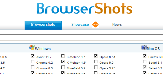
One of the things you must know as a web designer is that your work operates in a finicky and unpredictable environment: web browsers. It’s not enough that your designs work on a few web browsers, they need to work in as many browsing situations as you can possibly afford. Before production – test your prototypes using tools like Browsershots.
10. Make Designs that are Flexible and Maintainable
A good web designer makes sure that the site can easily be updated or modified in the future. Designing websites that are malleable and easy to maintain is a sign of a great web designer. Make your work as modular as possible by separating style from structure.
Know that our industry is dynamic and still young – things change in a very short amount of time. Keeping this thought in mind will promote the creation of flexible web designs.
What are your web design tips?
If you have more tips to share to beginning web designers – kindly share them in the comments.
“Rather than tailoring disconnected designs to each of an ever-increasing number of web devices, we can treat them as facets of the same experience. We can [make our] designs […] more adaptive to the media that renders them.”
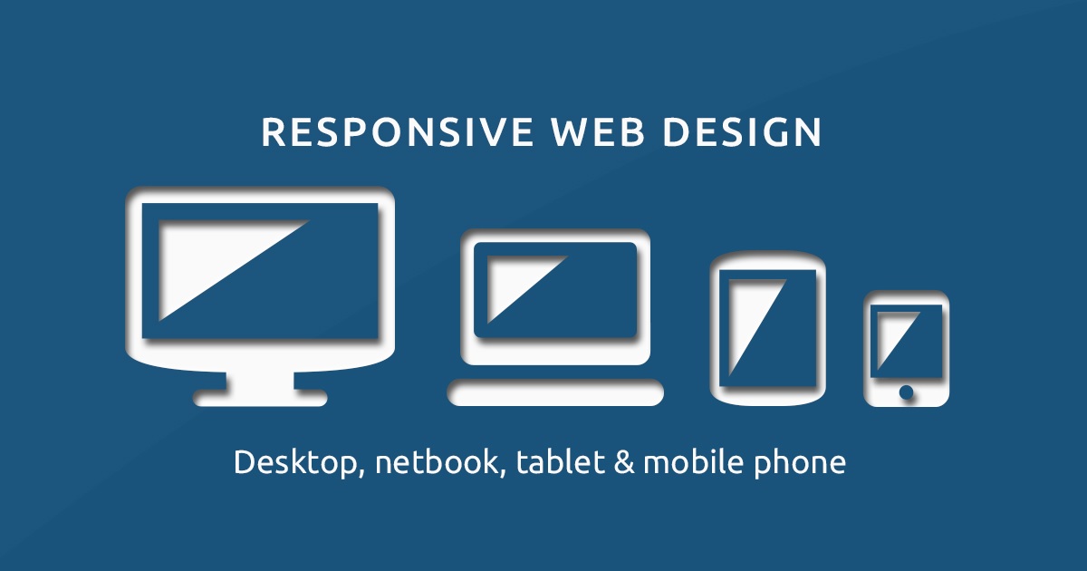
Eight years later, responsive web design has reached critical mass. It’s now standard practice to create a consistent, yet tailored, experience across every device—including those that have yet to be released.
“A media query allows us to target not only certain device classes but to actually inspect the physical characteristics of the device rendering our work,” Marcotte explains.
Media queries thus allow developers to use condition checks to alter web designs based on the properties of the user’s device. This is superior to simply defining breakpoints in the HTML/CSS, as it’s a more tailored experience for the user.
When flexible grids are created using CSS, the columns automatically rearrange themselves to fit the size of the screen or browser window, whether the user is on a 21-inch desktop computer, a 13-inch laptop, a 9.7-inch tablet, or a 5.5-inch mobile phone.
“Fluid layouts [….] put control of our designs firmly in the hands of our users and their browsing habits,” Marcotte explains.
This enables designers to maintain a consistent look and feel across multiple devices. Plus, it saves everyone time and money by allowing designers to update one version of the website versus many.
Marcotte refers here to using code that prevents rich media files from exceeding the dimensions of their containers, as well as viewports. As the “flexible container resizes itself,” he explains, so does the visual within it.
Given that there are over 8.48B unique devices in existence today, this functionality allow teams to create timeless designs capable of adapting to any device, regardless of its size or shape.
Together, these three types of functionality allow designers to craft responsive websites.
But, Marcotte explains, that’s just the beginning:
“Fluid grids, flexible images, and media queries are the three technical ingredients for responsive web design, but it also requires a different way of thinking. Rather than quarantining our content into disparate, device-specific experiences, we can use media queries to progressively enhance our work within different viewing contexts.”
Below, we’ve included 11 examples that go beyond the fundamental criteria for responsive web design. Each website offers an experience that’s tailored to the user’s unique context.
Dropbox has done a great job of using a fluid grid and flexible visuals to design a standout responsive website. Not only does the font color change to accommodate the background color when shifting from desktop to handheld devices, but the image changes orientation as well.
Accounting for context, Dropbox offers a tailored experience across each device. For example, in an effort to prevent users from bouncing, a small arrow directs desktop users to scroll down to see more content. The same arrow is absent from handheld devices, since it’s assumed that users will naturally scroll on a device with touchscreen capabilities. Similarly, their signup form is visible on desktop devices, but it’s hidden behind a call-to-action button on tablets and mobile devices, where space is limited.
Dribbble’s website features one of the hallmarks of responsive web design: a flexible grid, and it condenses from five columns on desktop and laptop computers to two columns on tablets and mobile phones.
To prevent their website from feeling cluttered on mobile devices, Dribbble has removed several items. For example, shots are no longer attributed to their maker and the view, comment, and like counts are no longer nested beneath each item. They’ve also hidden the menu behind a hamburger icon and removed the search bar.
GitHub’s website offers a consistent experience across every device. However, there were a few noticeable differences:
When shifting from desktop to tablet devices, the area above the fold changes from a two-column layout to a single-column layout, with the copy above the signup form instead of beside it.
Unlike on desktop and tablet devices, where their signup form is a central focus, GitHub presents only a call-to-action button on mobile. Users must click the call to action to surface the form.
Like Dribbble, GitHub has also removed the search bar and hidden the menu behind a hamburger icon on handheld devices. This is a pretty common practice, as it helps reduce clutter on mobile devices, where space is limited.
This is another fantastic example of mobile responsive web design. Their website loads remarkably fast at four seconds using 3G connections. More importantly, the look and feel of Klientboost’s website stays consistent across all devices, yet they’ve managed to tailor their user experience to each device.
While the full menu, including a “Get Proposal” call-to-action button and “We’re hiring!” callout, is viewable from desktop and laptop computers, tablet and mobile devices reveal condensed versions of the menu. Users visiting their website from tablet devices are shown a hamburger menu icon and callout, whereas those visiting from mobile phones are shown the menu icon and call-to-action button.
Magic Leap has designed a simple, mobile-first website with parallax scrolling that brings their stunning illustrations to life. Given that mobile phones and tablets are now responsible for 56.74% of global internet usage, their approach makes sense.
Magic Leap’s user experience is consistent across all devices, with one exception: the microcopy that directs users to scroll, which is included on desktop computers and tablets, but excluded from mobile devices, where it’s natural for users to scroll.
Even with a 3G connection, their website loads in seven seconds—well below the global average of 22 seconds. For a website featuring responsive animation, that’s not too shabby.
Shopify’s user experience is consistent across all devices. Only the call-to-action button and illustrations changed between desktop to mobile devices.
On personal computers and tablets, the call-to-action button is to the right of the form field. On mobile devices, it’s beneath.
Similarly, the illustrations are to the right of the copy on personal computers and tablets, whereas they’re placed beneath the copy on mobile devices.
Like most websites, Shopify’s menu is also replaced by a hamburger icon on handheld devices.
Despite using image carousels to show off their customers, they’ve managed to keep their page load speed below five seconds, which is pretty impressive.
Smashing Magazine goes above and beyond, offering a tailored experience across every device. Their website features a two-column layout, full menu, and combination mark on desktop, which converts to a one-column layout and condensed menu with lettermark on tablets and mobile devices.
Smashing Magazine’s website is also a shining example of inclusive design. The menu shown to desktop users features both labels and icons. And I love how, instead of using a run-of-the-mill menu icon, they’ve opted for a call-to-action button with the word “menu” and a search icon. Digital natives have no problem navigating websites from handheld devices, but other generations don’t necessarily know what hamburger icons represent.
Slack’s brand is known for being simple and human. It’s no surprise that their website follows the same guidelines.
Their flexible grid easily adapts to viewports of all sizes and shapes. For example, while customer logos are presented in a three-column layout on desktop and laptop computers, they’re shown in a single-column layout on handheld devices.
Slack’s website is also designed to be easy to use. For example, their call-to-action buttons span the entire column on tablets and mobile phones, which helps users avoid clicking the “Sign in” hyperlink below.
Treehouse offers a seamless experience across all platforms. Their menu gets progressively smaller across devices—desktop and laptop computers feature a four-item menu, tablets feature a two-item menu and hamburger icon, and mobile phones offer a one-item menu and icon.
Their form fields experience the same change. They’re presented in two columns on desktop and laptop computers and one column on tablets and mobile phones.
Like other companies, WillowTree includes a full menu on desktop devices and a condensed menu on handheld devices. But unlike others, they’ve introduced a static navigation bar at the top of the page, which creates a more delightful experience for users with handheld devices. They’ve also added a text-based call to action on the mobile version of their website for added convenience.
Like other responsive websites, the grid they’ve constructed to present customer logos is extremely flexible. It collapses from five columns on desktop computers to four columns on tablets to two columns on mobile phones.
Similar to Treehouse, the area above the fold converts from two columns on desktop to one column on mobile, with the call-to-action button shifting from beside the copy to beneath it.
WIRED’s website has a dynamic layout featuring several columns and a sidebar on desktop devices, which converts to a single column on handheld devices.
When shifting from tablet to mobile devices, their menu shrinks to include only their logo, a menu icon, and a link to subscribe. In an effort to keep things simple, search functionality and the ability to filter WIRED’s newsfeed by section isn’t available on mobile.
One area where WIRED shines is using flexible images. The crop on their feature images changes across platforms. On desktop and laptop computers, images vary between squares and rectangles, giving users plenty to explore with their eyes. Yet, on handheld devices, all feature images are cropped using a 16:9 ratio.
What’s your favorite responsive website?
Let us know and we might include it in a future post about responsive design.
When it comes to designing or redesigning a website, it’s easy to get hung up on the aesthetics. Does that shade of blue look right? Should the logo be on the right side of the screen, or left? What if we put a giant animated GIF in the middle of the page?
However, in a world where folks have more than 1.8 billion websites they can potentially land on, you need to make sure yours is not just a pretty face. It should be designed for usability, how easy your website is to use, and user experience (UX), how enjoyable it is to interact with your website.
Now, you could spend years studying the ins and outs of these disciplines But for the sake of giving you a jumping-off point, we’ve assembled a list of the fundamental guidelines and best practices you can apply to your next website redesign or website launch. Then, we’ll review 10 features you’ll need on your site to put these recommendations into practice. Let’s dive in.
While the appearance of your website is certainly important, most people aren’t coming to your site to evaluate how slick the design is. They want to complete some action, or to find some specific piece of information.
Therefore, unnecessary design elements (i.e., those which serve no functional purpose) will only overwhelm and make it more difficult for visitors to accomplish what they’re trying to accomplish.
From a usability and UX perspective, simplicity is your best friend. If you have all the necessary page elements, it’s hard to get too simple. You can employ this principle in a variety of different forms, such as:
Colors: Basically, don’t use a lot. The Handbook of Computer-Human Interaction recommends using a maximum of five (plus or minus two) different colors in your design.
Typefaces: The typefaces you choose should be highly legible, so nothing too artsy and very minimal script fonts, if any. For text color, again, keep it minimal and always make sure it contrasts with the background color.A common recommendation is to use a maximum of three different typefaces in a maximum of three different sizes.
Graphics: Only use graphics if they help a user complete a task or perform a specific function (don’t just add graphics willy-nilly).
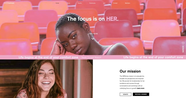
Here’s a great example of a simple but effective homepage design from HERoines Inc:
Closely tied to the principle of simplicity, visual hierarchy means arranging and organizing website elements so that visitors naturally gravitate toward the most important elements first.
Remember, when it comes to optimizing for usability and UX, the goal is to lead visitors to complete a desired action, but in a way that feels natural and enjoyable. By adjusting the position, color, or size of certain elements, you can structure your site in such a way that viewers will be drawn to those elements first.
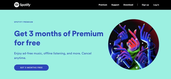
In the example below from Spotify, you can see that the main heading “Get 3 months of Premium for free” sits atop the visual hierarchy with its size and page position. It draws your eye to their mission before anything else. This is followed by the “Get 3 Months Free” CTA, which prompts action. Users can click this CTA, or scan the menu items above for more actions.
Planning out intuitive navigation on your site is crucial to help visitors find what they’re looking for. Ideally, a visitor should land on your site and not have to think extensively about where to click next. Moving from point A to point B should be as frictionless as possible.
Here are a few tips for optimizing your site’s navigation:
Keep the structure of your primary navigation simple (and near the top of your page).
Include navigation in the footer of your site.
Consider using breadcrumbs on every page (except your homepage) so users remember their navigation trail.
Include a search bar near the top of your site so visitors can search by keywords.
Don’t offer too many navigation options per page. Again, simplicity!
Include links within your page copy, and make it clear where those links go.
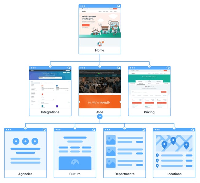
Don’t make users dig too deep. Try making a basic wireframe map of all your site pages arranged like a pyramid: Your homepage is at the top, and each linked page from the previous forms the next layer. In most cases, it’s best to keep your map no more than three levels deep. Take HubSpot’s site map, for example.
One more pointer: Once you’ve settled on what your site’s main (top) navigation will be, keep it consistent. The labels and location of your navigation should remain the same on every page.
This leads us nicely into our next principle…
4. Consistency
In addition to keeping your navigation consistent, the overall look and feel of your site should be similar across all of your site’s pages. Backgrounds, color schemes, typefaces, and even the tone of your writing are all areas where consistency has a positive impact on usability and UX.
That’s not to say every page should follow the same layout. Instead, create different layouts for specific types of pages (e.g., landing pages, informational pages, etc.). By using those layouts consistently, you’ll make it easier for visitors to understand what type of information they’re likely to find on a given page.
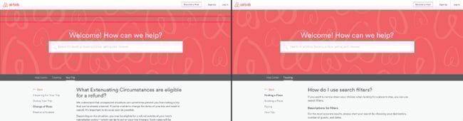
In the example below, you can see thatAirbnb uses the same layout for all of its “Help” pages, a common practice. Imagine what it would be like from a visitor’s perspective if every “Help” page had its own, unique layout. There would probably be a lot of shoulder shrugging.
According to Statista, 48% of page global views were from mobile devices like smartphones and tablets. And according to our research, 93% of people have left a website because it didn’t display properly on their device.
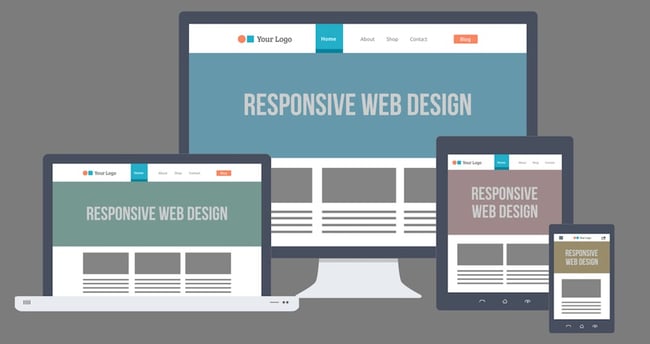
The takeaway here: To provide a truly great user experience, your site has to be compatible with the many different devices that your visitors are using. In the tech world, this is known as responsive design.
Responsive design means investing in a highly flexible website structure. On a responsive site, content is automatically resized and reshuffled to fit the dimensions of whichever device a visitor happens to be using. This can be accomplished with mobile-friendly HTML templates, or by creating a special mobile site.
Ultimately, it’s more important to provide a great experience across different devices than look identical across those devices.
Alongside mobile-friendliness, it’s worth your while to test your website’s cross-cross browser compatibility. In all likelihood, you’ve only viewed your site on one web browser, be it Google Chrome, Safari, Firefox, or something else.
Now is the time to open your pages on each of these browsers and evaluate how your elements appear. Ideally, there won’t be much difference in presentation, but you can’t know for sure until you see for yourself.
6. Accessibility
The goal of web accessibility is to make a website that anyone can use, including people with disabilities or limitations that affect their browsing experience. As a website designer, it’s your job to think of these users in your UX plan.
Like responsiveness, accessibility applies to your entire site: structure, page format, visuals, and both written and visual content. The Web Content Accessibility Guidelines (WCAG), developed by the Web Accessibility Initiative and the World Wide Web Consortium, set the guidelines for web accessibility. In a broad sense, these guidelines state that websites must be:
Perceivable: Visitors are aware of the content on your site.
Operable: The functionality of your website should be possible in different ways.
Understandable: All content and alerts can be easily understood.
Robust: Your website is usable across different assistive technologies, devices, and browsers.
A big challenge in web design is balancing originality with your expectations. Most of us are expert internet users, and there are specific conventions we’ve grown accustomed to over time. Such conventions include:
Placing the main navigation at the top (or left side) of a page.
Placing a logo at the top left (or center) of a page.
Making the logo clickable, so it always brings a visitor back to the homepage.
Having links and buttons that change color/appearance when you hover over them.
Using a shopping cart icon on an ecommerce site. The icon also has a number badge signifying the number of items in the cart.
Ensuring image sliders have buttons users can click to manually rotate slides.
While some might opt to throw these out the window for the sake of uniqueness, this is a mistake. There’s still plenty of room for creativity within the constraints of web conventionality.
Let’s briefly consider another field of design, architecture. Building codes are put in place so that folks can easily and safely inhabit spaces. An architect doesn’t complain about these codes or violate them because, aside from legal repercussions, they assure safety and comfort of guests. It doesn’t matter how dazzling the building looks — if you trip on uneven stairs or you can’t get out in a fire, you might prefer to stay outside.
In the same way, you can craft a memorable experience while meeting user expectations. If you violate what users anticipate, they may feel uncomfortable or even frustrated with your site.
8. Credibility
Sticking to web conventions lends your site credibility. In other words, it increases the level of trust your site conveys. And if you’re striving to build a site that provides the best user experience possible, credibility goes a long way.
One of the best methods to improve your credibility is to be clear and honest about the product or service you’re selling. Don’t make visitors dig through dozens of pages to find what it is you do. Be up-front on your homepage, and dedicate some real estate to explaining the value behind what you do.
Another credibility tip: Have a pricing page, also linked on the homepage. Rather than force people to contact you to learn more about pricing, list your prices clearly on your site. This makes your business appear more trustworthy and legitimate.
At the end of the day, usability and user experience hinge on the preferences of the end-users. After all, if you’re not designing for them, who are you designing for?
So, while the principles detailed in this list are a great starting point, the final key to improving the design of your site is to conduct user testing, gather feedback, and implement changes based on what you’ve learned.
And don’t bother testing usability by yourself. You’ve already invested a lot of time into your design, which brings your own biases into the equation. Get testers who have never seen your site before, the same as any first-time visitor.
Here are a few user testing tools to get you started:
Crazy Egg: Track multiple domains under one account and uncover insights about your site’s performance using four different intelligence tools — heat map, scroll map, overlay, and confetti.
Loop11: Use this tool to easily create usability tests — even if you don’t have any HTML experience.
Hopefully, these guidelines are useful in informing the structure of your web pages and website as a whole. But, how does one put these guidelines into practice? Let’s take a look at some actionable best practices you can follow during the design process.
Website Design Best Practices
Select a typography that’s easy to read and skim.
Choose a color scheme that suits your brand.
Use white space to break up text and other elements.
Use texture to add personality and depth.
Add images to engage and inform readers.
Simplify your navigation.
Make your CTAs stand out.
Optimize for mobile.
Limit the options presented to users.
1. Select a typography that’s easy to read and skim.
Typography refers to how type — meaning letters and characters — are arranged and presented on the page. Since website typography affects not only how we read but how we feel about text on a web page, it’s important to pick carefully.
Ideally, you want a typeface that is:
easy to read
easy to skim
accessible to all users
legible across multiple devices and screen sizes
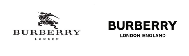
You also want it to match the look and feel of your brand. For example, the luxury fashion brand Burberry refreshed its logo for the first time in 20 years in 2018. It replaced the old serif typeface with a bold, all-caps, sans serif typeface and dropped the knight emblem. The result is a simpler and more modern-looking logo that’s easier to read on any screen — and that reflects changes in the company to become more transparent and appeal to a younger generation.
Like typography, color can affect not only how we understand and interact with content, but how we feel about it. Your color scheme should therefore check off the same boxes as your website typography. It should:
reinforce your brand identity
make your site easy to read and navigate
evoke emotion
look good
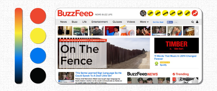
Buzzfeed, for examples, uses the primary colors yellow and red to grab users’ attention and get them excited about the content. It reserves the use of the primary color blue — which is associated with trust — exclusively for links and CTA buttons. Both emotions are ideal to evoke for a media site.
3. Use white space to break up text and other elements.
Whitespace refers to the negative areas in any composition. Whitespace provides users with visual breaks as they process a website’s design or content, which is not only aesthetically pleasing. By minimizing distractions, whitespace makes it easier for users to focus, process information, and understand what it’s important.
That means you can use whitespace to avoid causing information overload or analysis paralysis — and to emphasize important elements on the page. This might help persuade users to take a specific action, like sign up for a newsletter, shop your latest collection, and more.
For example, Eb & flow Yoga Studio uses whitespace to lead users toward a specific action: to sign up for three weeks of classes. Notice that whitespace doesn’t mean the absence of color or imagery. Instead, it means that every element on the page is positioned strategically, with lots of space in between, to avoid overwhelming or confusing visitors.
Resembling a three-dimensional, tactile surface, web textures aim to replicate the physical sensation of touch with another sensation — sight. They’re a great design alternative to solid color backgrounds, particularly if you want to add personality and depth to your site.
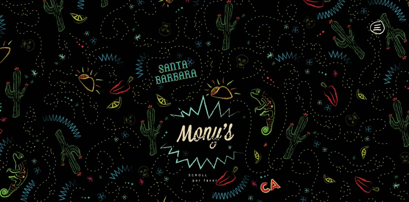
Take a look at the texture on the homepage for the Santa Barbara-based restaurant Mony’s Tacos below. It looks like chalk drawn on a blackboard, doesn’t it? I don’t know about you but I can almost feel the chalk on my fingers just from looking at it. It’s the perfect look for a restaurant that aims to be California’s preferred Funk Zone choice for Mexican delights.
Striking a balance between text and images is essential in website design. Incorporating visuals can make your content more informative, engaging, and memorable. You’ve probably heard the statistics that people remember only 20% of what they read, but 80% of what they see? While the exact percentages are debated, the basic idea isn’t. It’s easier for some people to learn and process information visually.
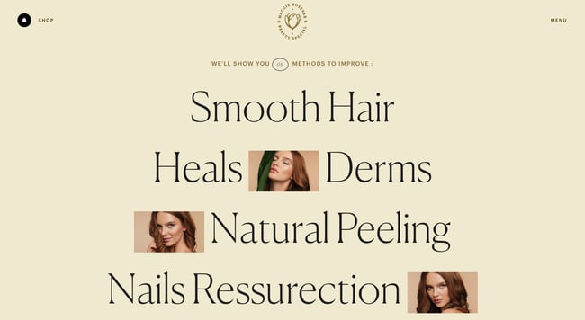
Here’s a unique example of breaking up text with images from a cosmetic company’s website. This shows how endless the possibilities of incorporating imagery into your website design are.
Navigation is one of the most important design elements on a website. It impacts whether visitors arrive on your homepage and browse, or click the “Back” button. That’s why it’s important to keep it as simple as possible.
Many websites opt for a horizontal navigation bar. This navigation style lists the major pages side by side and is placed in the website header.
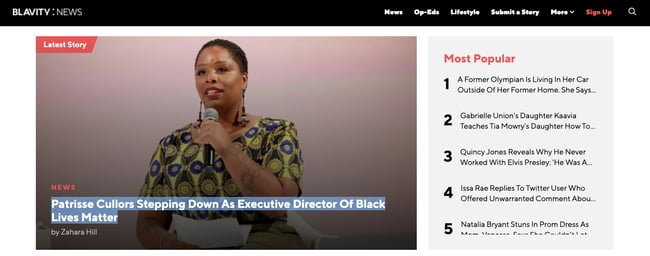
Take the navigation bar on Blavity as an example. The sections featured include three content categories — “News,” “Op-Eds,” and “Lifestyle” — as well as links to their submission page and sign-up page. This provides visitors with easy access to the pages they’re likely looking for. Other nav items are placed in a dropdown menu labelled “More” so they’re still easy to find but not cluttered into the top-level navigation. Finally, the navigation bar is sticky so visitors won’t have to scroll up and down the page to browse the site.
CTAs are elements on a web page, advertisement, or another piece of content that encourages the audience to do something. The call to action could be to sign up, subscribe, start a free trial, or learn more, among many others.
You want your CTAs to pop in your website design. To make that happen, consider how you’re using color as well as other elements like background color, surrounding images, and surrounding text.
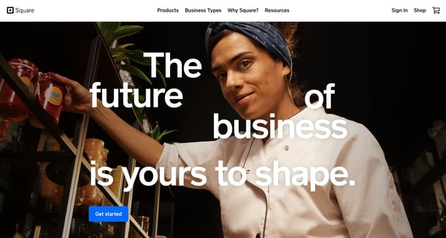
Square provides an excellent call-to-action example. Using a single image to showcase the simplicity of using their product, Square uses bold typography to also show how unique and future-oriented their product is. Against this dramatic backdrop, the blue “Get Started” CTA awaits your click.
We’ve already discussed how important it is for your website to be responsive. But since mobile devices accounted for 59% of organic search engine visits in 2021, we’re doubling down on how important it is to design your website to be mobile-friendly. That might mean altering or removing some elements that would clutter smaller screen sizes or negatively impact load time.
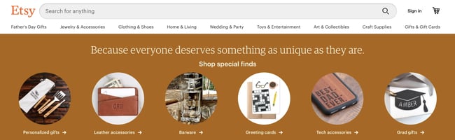
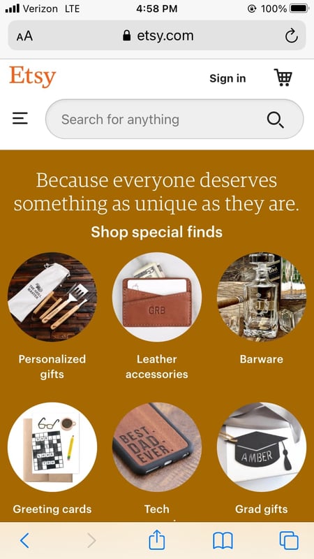
For an example of one of the best mobile website designs, compare Etsy’s homepage on desktop vs mobile. On desktop, you’ll see a navbar with categories. Hovering over each category will reveal a dropdown menu.
On mobile, this collapses behind a hamburger button, which improves the appearance and performance of the mobile site. You’ll also notice that the images are larger — perfect for tapping with your finger on a mobile screen.
9. Limit the options presented to users.
According to Hick’s Law, increasing the number and complexity of choices will increase the time it takes for a person to make a decision. This is bad news in website design. If a website visitor is presented with too many options, they might get frustrated and bounce — or they might pick an option you don’t want, like abandoning their cart. That’s why it’s important to limit the number of options presented to a user.
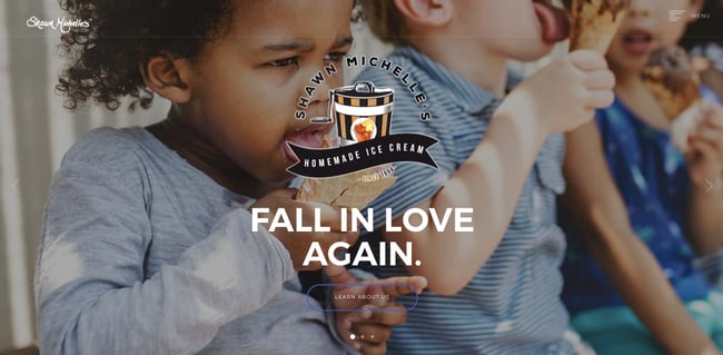
For example, a visitor landing on the homepage of Shawn Michelle’s Ice Cream will have three options: to learn more about the company, the flavors, or the ingredients. But instead of presenting all three options at the same time, they are presented one at a time in a slider. This is a great example of implementing Hick’s Law in UX design.
Now we understand the principles and best practices that should guide you throughout the design process. In the next section, let’s run down the essential page elements that you should strongly consider including in your design plan.
Website Design Requirements
Header and Footer
Menu Navigation
Search Bar
Branding
Color Palette
Headers
Clear Labels
Visuals and Media
Calls to Action (CTAs)
Whitespace
1. Header and Footer
The header and footer are a staple of just about every modern website. Try to include them on most of your pages, from your homepage, to your blog posts, and even your “No results found” page.
Your header should contain your branding in the form of a logo and organization name, menu navigation, and maybe a CTA, and/or a search bar if well-spaced and minimal. On the other end, your footer is where many users will instinctively scroll for essential information. In your footer, place contact information, a signup form, links to your common pages, legal and privacy policies, links to translated versions of your site, and social media links.
2. Menu Navigation
Whether it’s a list of links across the header or a tidy and compact hamburger button in the corner, every website needs a guide for navigation positioned at the top of at least your homepage and other important pages. A good menu limits the number of clicks to reach any part of your website to just a few.
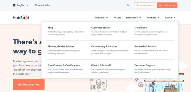
To reduce clutter, you might consider making some or all menu options a dropdown menu with links within it, as can be seen on HubSpot’s homepage.
3. Search Bar
In addition to menu navigation, strongly consider placing a search bar at the top of your pages, so users can browse your site for content by keyword. If incorporating this functionality, make sure your results are relevant, forgiving of typos, and capable of approximate keyword matching. Most of us use a high-quality search engine every day, be it Google, Amazon, YouTube, or elsewhere. These all set the standard for your own site search.
4. Branding
Remember the conventions we’ve discussed? One that you see practically everywhere is a logo in the top left corner. On first landing, many visitors’ eyes will instinctively shift to this region to check they’re in the right place. Don’t leave them hanging.
To reinforce this notion, incorporate your company branding into every element you add, piece of content you post, and color scheme you create. That’s why we recommend establishing brand guidelines if you haven’t already — check out our style guide for a reference.
5. Color Palette
Color choice plays a major role in your site’s usability and UX as well. This decision tends to be more subjective than other requirements in this list. But, like everything else we’ve discussed, try to simplify — limit your color selection to 3-4 prominent colors at most.
Starting a color palette from scratch can be surprisingly difficult the first time. We seem to intuitively pick up on which colors work well together and which don’t, but we stumble when trying to pick from the infinite combinations available.
The solution? Try a color palette that’s been shown to work on other websites. Take influence from your favorite sites, and see our list of our favorite website color schemes to get started.
6. Headings
Headings are key to establishing the visual hierarchy we discussed earlier, especially on text-heavy pages. As users skim your pages what you need, a clear and to-the-point heading alerts readers to stop scrolling after finding what they want. Use only as many headings as there are distinct sections of your page, as too much blown-up and bolded text will dampen this effect.
7. Clear Labels
Whenever a user takes an action on your website, it must be obvious exactly what they’re doing and/or where they’re going. All buttons should have clear text or an icon to precisely and concisely signal their purpose. The same goes for in-text links and widgets (simple interactive elements, like dropdowns and text forms).
For example, a button linking to a pricing page should just read “Pricing” — anything beyond that (e.g., “See our prices”, “Check out the pricing page for a deal”) is superfluous. A search bar/button only needs a search glass icon (🔍), and perhaps also the word “Search”, to denote its purpose.
User testing can be a major help here. While you yourself know what all of your interactive page elements do, the same can’t be said for a new user. Testing will give valuable insight into what users think your labels mean beyond your own perspective.
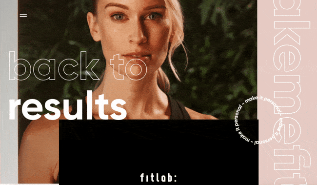
8. Visuals and Media
When incorporating static images, gifs, videos, and other media into your pages, remember to be consistent and intentional in your choices. These elements will draw attention over most other text and will likely stay in users’ minds, so choose wisely.
Here’s just one example of effective media on a homepage. Notice how every image complements the page aesthetic and supports the offer of personalized fitness training with results.
Also, all images and videos should be optimized for search engines and include descriptive alt text for accessibility.
9. Calls to Action (CTAs)
Having a pleasing website is great, but how do you know whether your visitors are actually doing what you want? Are they engaging with your content? This is where CTAs come into play.
A CTA is any page element that prompts user action. The action could be adding a product to a card, downloading a content offer, or signing up for an email list. Make your CTA elements prominent in the visual hierarchy (remember our Spotify example), but not intrusive or distracting like many click-through ads tend to be.
If you need ideas for sleek CTAs that drive more conversions, see our CTA examples list.
10. Whitespace
As mentioned above, sometimes it’s about the elements you don’t include. After reading these guidelines and requirements, you may feel tempted to stuff your pages with all the bits and bobs needed for a flawless UX. Don’t forget that your viewers need room to digest all this new info, so give your elements room to breathe.
But, how much whitespace should you have? That’s another personal call, and varies from site to site. So, user testing is handy here as well. What are people focusing on? Do they feel overwhelmed with the density of content? Once again, it all ties back to our first guideline, simplicity.
Design that Puts Users First
Indeed, web design is largely subjective — your website’s look and experience isn’t going to please everyone. However, there are also tried-and-true UX principles that, when carefully considered and incorporated, help visitors feel more at home.
According to Amazon Web Services, 88% of website visitors are less likely to return to a website after a poor experience. And how could you blame them? We’ve surely all been there.
So, as a final bit of usability/UX wisdom, start caring more! Imagine yourself into the shoes (or, more accurately, browser windows) of your visitors, and keep them in mind every step of the design process.
Web design is quite complex and daunting, but with the development of Internet and technology, web design overflow than ever before nowadays. Hence, becoming a web designer has become the main trend among young designers. Today, I will guide you about how to learn web design at home briefly.
1. First, you should know about what is web design?
Visual+interaction=web design core
Many young designers often misunderstand the concept of web design, web design is about design, not about coding and front-end development. Of course, it would be great if you know some coding language (HTML, CSS, Java), but you can’t get yourself deep into front-end development, that’s not the core of web design. Web design is to solve the communication problems between users and web page information.
2. 9 web design skills young designer should master
To learn the basic coding language, it includes:HTML and CSS with simple language to teach you.
2. Google Code University
Another coding learning website which is created by Google developer.
3.Code Avengers
I like this learning website, because of it’s just like big adventure that allow you to participate in their coding challenge programme and bug hunting.
HTML and CSS:
30 Days to Learn HTML and CSS
A Beginner’s Guide to HTML & CSS
Don’t Fear the Internet
Conclusion:
No matter what position you are in, learning is the only way to achieve your goal. If you want to know about how to learn the web design at home, above is all you have to know. Stop wasting your time on Facebook or Twitter to look for answers. You can build your design circle in there, but you can’t be a web designer by tooling around. Wish you good luck.
Web design is a highly individual process. In order to create truly unique and impactful compositions, designers must let go of their preconceived ideas of what a website should look like. Instead, they must let their brand values, audience, and point of difference be their ‘true north’, guiding them through the design process.
But while the design is all about breaking the ‘rules and creating your own, there are a few failsafe web design principles all designers should keep in mind. These tried-and-tested guidelines are essential for creating polished and functional websites that engage your audience. Read on for 20 essential web design principles to inform your next creations.
01. Use readable and web-friendly fonts
The role of typography in web design can’t be understated. Using the right fonts exemplifies your brand personality and immediately grabs your audience’s attention. However, it’s not just about looking good. The typefaces you use in your web design also need to be functional and readable. After all, if the user has to squint just to see your text, they’re likely going to struggle to connect with your message. Arial, Helvetica, Times New Roman, and Courier New are all examples of web-friendly fonts. This means they maintain legibility at any size and work well across both mobile and desktop.
Matt Steel via Design Bombs
Typography takes centre stage in this website design for writer and designer Matt Steel. He has used a versatile serif font that remains eye-catching when used small and lightweight, or big and bold.
Want to let your typography do the talking in your next web design project? Canva’s Red Geometric Shapes Sale Website Ad template provides the perfect starting point for a text-focused website header.
02. Utilise the ‘F’ pattern
Humans are creatures of habit—and the way we consume content is no exception. A Nielsen Norman Group study into eye-tracking revealed that when we scan the information on a website, the majority of us do so in an F-shaped pattern. This means we first read important headlines along the top of the page, then scan down the left side of the page at any numerals, bullet points or sidebars, then across the page again at any bolded text or sub-headings. In web design, using an ‘F’ pattern involves mimicking the eye’s natural path so as to not disrupt the visual flow. This is especially important on the landing and sales pages, where conversion is the ultimate goal.
via Big Commerce
You can see this in action on BigCommerce’s homepage. They have expertly crafted an F-shaped layout to prompt the user to take the desired action—which in this case, is taking the product tour. The eyes go straight to the header (aided by the bold typography and colorful underline) then across to the diagram that demonstrates how their product works, then back down to the supplementary info and call-to-action.
03. Or the ‘Z’ pattern
While the ‘F’ pattern is a common eye-scanning pattern, it’s not the only one. The ‘Z’ layout is another important design principle. This is when the eye scans from left to the top right, forming an imaginary horizontal line. Them, it goes down to the left side of the page, creating an imaginary diagonal line. Lastly, it trails back across to the right again, forming a second horizontal line.
So, when would you use a ‘Z’ layout over an ‘F’ one? While the ‘Z’ layout tends to perform best for landing pages, the Z-pattern is generally better suited for pages with very minimal information where the main takeaway is the call-to-action.
via UX Planet
Chances are, you’ve seen this pattern in action before—because it’s used on the login page for Facebook! The eye naturally goes directly to the logo, but the Z pattern guides the users through the two calls-to-action—signing in or joining up.
04. Use negative space
Sometimes, you can turn a negative into a positive! This is certainly the case with using negative space in your website design. Also known as blank space or white space, this is the empty areas between the visual elements in your design (for example, the photos, text and icons)
This principle has been around as long as art itself, but it plays a particularly important role in web design. Overly cluttered and complex websites tend to overwhelm your user and prevent them from taking action—which is the exact opposite of what you want! Meanwhile, using negative space draws their attention to the most important content, increases text readability and creates a seamless user experience.
via Apple
You can see that working here. Apple’s focus has always been on their products, as they don’t need to rely on bells and whistles to sell to their audience. This is reflected in their use of negative space in this minimalistic layout, where they keep the spotlight on their new product—the iPhone X.
Want to incorporate this ‘less-is-more approach into your own web design? Try using a Canva template like the Pink Flower Wedding Events Website, which already has plenty of negative space built into it.
05. Keep your design consistent
You already know that consistency is key in web design. But it’s important to note that this means more than just keeping your fonts, colors and icons uniform across your branding. It also means keeping the spacing consistent in your layouts, too. This helps give your website a polished and professional feel, which boosts brand credibility.
Book Worm website design by Halo Lab via Dribbble
This is evident in this website design for electronic library company, Bookworm. While they have used a range of different font sizes and different image dimensions, the spacing between the different visual elements remains consistent. This helps to create a sense of order and harmony in an otherwise busy composition.
Canva’s built-in alignment features make it easy to make sure your text and paragraph spacing is consistent in your design.
06. Simple and logical page navigation
A website without clear navigation is like a maze without a map. It makes perusing your website unnecessarily difficult and confusing for your visitors. On the other hand, a well-designed website navigation makes for a streamlined and relaxing user experience. This can take many forms—whether it’s a drop-down menu, sidebar or sticky navigation. The key is that it’s easy to locate, works well across all devices and isn’t overloaded with different options.
via Equus Design
In this example from web design company Equus, the navigation is simple yet effective. They have opted for a monochrome menu bar with a clean, sans-serif font, which stands out against the colorful header. They have also kept their menu options to one word, which helps creates consistency and ensure it doesn’t take up too much space.
07. Use a complementary color palette
The color palette you use sets the mood of your web design. For example, using lots of dark browns and blacks can create a rustic, moody feel, while pastel colors can look quite playful and modern. Whatever vibe you go for, it’s important to make sure the colors you use work well together. Sometimes, this means sticking to similar shades but opposites can also attract (for example, orange and teal) Whether you go for colors that are opposite or next to each other on the color wheel, they need to be complementary.
via Liebe Quark
You can use many different colors and still create a visually appealing website, as evident in this web design for yoghurt company Liebe Quark. They have used a combination of warm and cool, light and dark colors to create a contrasting and eye-catching header. The chequered, grid design prevents it from looking too chaotic, while using little pops of the colors across the tiles helps to tie it all together.
Prefer to keep your color scheme simple? The Blue Fashion Blogger template in Canva is perfect for customizing with two of your own complementary brand colors.
08. Keep the audience in mind
Good designers know that it’s not just about creating a website that they think looks good. To really create a website that cuts through the noise online, they must speak directly to their audience through design. Put yourself in your audience’s shoes and ask yourself what their biggest needs, desires, and fears are. This should dictate your design choices, from the fonts and colors you use, to your button text and website navigation.
Wearism website design by Cuberto via Dribbble
In this concept for a young women’s online fashion boutique, the designer has clearly designed the target audience in mind. The bright and feminine color scheme, iconography and bold bubbly text all work together to create a fun and modern feel that is likely to appeal to teen girls.
Want to achieve a similar aesthetic for your own website design? The Pink And Blue Rad Facebook Ad Template in Canva is an excellent jumping off point for you to personalize with your own branding.
09. Optimize buttons and calls-to-action
While buttons are often the last thing to be added to a web design, they play an indispensable role. They can be the deciding factor as to whether the user continues to navigate your website or closes the window. The buttons on your website should shout, not whisper. That is, they should stand out against the other visual elements on the page and be easy to find and click.
Huemor via Hubspot
This website from design studio Huemor is a great example of how creative use of buttons can really elevate your overall website. The use of illustration and cheeky reverse psychology in their call-to-action ‘launch, do not press’ works together to create a truly memorable user experience.
10. Maintain a visual hierarchy
We touched on visual hierarchy when we mentioned eye-scanning patterns and navigation. However, it’s such an important principle that it deserves a point of its own! While website design should be aesthetically-pleasing and innovative, it also needs to be logical. That is, you need to deliberately structure your content in a way that makes sense to the user—even if it’s only on a subconscious level.
Bitcoin website design by Mike | Creative Mints via Dribbble
This website for bitcoin mining company CTSO is a great example. The header text is clearly at the top of the designer’s visual hierarchy, followed by the navigation sidebar. However, rather than taking them away from the homepage, this is used to guide them through the various anchor points on the single-page homepage.
11. Pay attention to the details
The big picture is undoubtedly important when it comes to web design. After all, it’s how all the visual elements come together that dictates the overall look and feel of your website. However, it’s important not to overlook the little things. Paying attention to the finer details like your footer icons, text spacing, and micro-interactions really helps to set your website apart.
via Carbon Beauty
This website footer for natural cosmetics company Carbon Beauty is an excellent example. Not only does it compliment the brand’s sleek and minimalistic website, but it’s a work of art in itself. They have combined symmetry, lines, buttons and icons to help keep the audience on the page for longer and encourage them to engage with the brand in different ways.
12. Use Fitt’s Law
Coined by psychologist Paul Fitts in 1954, Fitt’s Law states that the amount of time it takes to move to a target directly corresponds with not only its distance but the size of the target, too. Although this theory originally related to the human motor system, it’s now a central principle of UX (user experience) design. Often used in relation to buttons, the idea is that the elements you want to be easily selectable (for example, your primary calls-to-action) should be large and positioned close to users.
Very Good Copy via Hubspot
You can see this in play with this website for copywriting studio, Very Good Copy. Presuming the user’s cursor will be somewhere near the top of the screen, the designer has placed the large button smack bang in the middle of the screen to encourage them to click. Of course, the fact that the button is bright yellow doesn’t hurt, either!
13. Choose your images wisely
They say a picture paints a thousand words and this is certainly the case in website design. Imagery can serve so many purposes in web design, whether it’s telling a story, demonstrating how a product works, evoking emotion or creating atmosphere. However, it’s important to keep in mind that not all photos are created equal. Be sure to thoughtfully select the photos you use in your web design. They should not only be of professional quality and high resolution, but they should fit your overall aesthetic and have a clear objective.
Subaru website via Dribbble
Take, for example, this website design for car company for Subaru. The landscape photography serves a very specific purpose—to evoke a sense of adventure and help the user imagine how they might use their new vehicle. After all—they’re not selling a car, they’re selling a lifestyle! This is far more effective than if they had used a simple product image of the car without context.
Like the idea of using an image background in your website design? Canva’s Jewelry And Accessories Online Store Website template can be easily swapped out with your own imagery. It’s a particularly effective option for businesses or e-commerce brands who want to showcase their products.
14. Prioritize the user experience
User experience isn’t just for UX designers. Anyone who wants their audience to take action on their website (whether it’s subscribing to a mailing list or buying something) should pay attention to the customer journey. The good news is, this doesn’t necessarily have to be a complex or highly technical process. It’s simply about making it as easy as possible for your audience to take the desired steps.
Book and Travel website design by tubik via Dribbble
This website for Book & Travel showcases simple UX design at its finest. They know exactly what their audience is there for—to search for and book flights and accommodation—so they have built this functionality straight into their homepage. This isn’t an overly complicated device, but it’s certainly an effective one!
15. Consider using grid systems
Using a grid layout is a foolproof way to make your website look neat, organized and professional. Essentially, these are intersecting horizontal and vertical lines that serve as guides to place and align the elements in your composition. This is a powerful visual tool that creates consistency and order in your design—which can be particularly useful when there’s a lot going on!
The Hilgart Blog website design by Ruslan Siiz via Dribbble
In this blog concept for The Hilgart, designer Ruslan Siiz has used a grid-based layout to form the basis of his layout. While there are some asymmetrical elements and different columns throughout this homepage, this makes it feel tidy and structured.
You can achieve a similar effect with Canva’s Pink Advocacy Portfolio template. Its ready-made grid layout will help you create visual balance in your own website design.
16. Avoid big chunks of text
You only get one chance to make a great first impression on a new website visitor. This is why it’s so important to make your brand offering immediately clear to your audience. While this partly comes down to your copywriting (the written content), your website design plays an important role, too. For this reason, using big chunks of text on your website is a definite no-no— especially on your homepage. Not only can it dilute your brand message, but it can make your website look cluttered and messy.
via Alpha Ocean Blue
This website for finance company Alpha Blue Ocean shows how that you don’t need a lot of text to make a serious impact. They have immediately showcased their brand purpose in just a few words (using a crisp white typeface that stands out against the vibrant blue background) However, they also give the user the option to reveal more information about them by using the navigation on the left.
Canva’s Teal Books and Publishers Online Store Website template has all the visual elements you need to simply and effectively communicate your brand message. Simply change out the heading and sub-heading with your own!
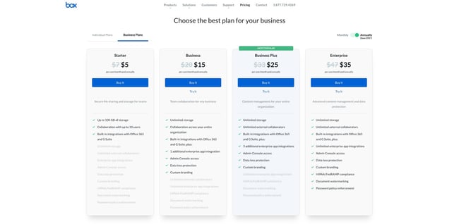
17. Use invariance
The principle of invariance is when you put one different option amongst an otherwise homogenous group. This can be an indispensable tool when designing pricing tables on your website.
Code Canyon Website
This pricing table from the Envato website theme Modern Bootstrap 4 is a great example of this principle in action. While most of the options feature a white box with black text and a red button, the coloring is inverted for the ‘corporate’ package. Naturally, the human eye goes straight to the one that is different—which can work in your favor when you’re trying to draw attention to a particular option or special offer! Invariance can also be used in navigation menus, when you’re trying to encourage the user to take a particular action.
18. Hick’s Law
Outside the design world, this principle is generally referred to as ‘decision fatigue.’ Named after British and American psychologists William Edmund Hick and Ray Hyman, it’s the idea that ‘with every additional choice increases the time required to take a decision.‘ So, the more you overload your user with too many different options (whether that’s buttons or menu options) the longer it’s going to take to entice them to take action. And as you generally only have a very narrow window of opportunity to make an impression, this is not a good thing! This is why it’s so important to limit your calls-to-action, and make the ones you do use as effective as possible.
Green Mountain Energy via CrazyEgg
This website for electricity company Green Mountain Energy has clearly been designed with Hick’s Law in mind. The user is given only two main calls-to-action (which clearly stand out, thanks to the orange button) which serve the very important purpose of identifying whether they’re a home or a business. The takeaway? Don’t include more calls-to-action than you absolutely need to.
19. Use symmetry
While there’s a time and place for more abstract, asymmetrical designs, you can’t go wrong with symmetry. Referring to when two halves of a whole perfectly mirror each other, it’s an easy way to immediately make your website design look more balanced, neat and professional.
Backpacks website design by Gabe Becker via Dribbble
This design concept for a backpack company proves that symmetry doesn’t have to be boring. Designer Gabe Becker has achieved both vertical and horizontal symmetry by placing the image of the girl in the middle of the header. This is mirrored by the perfectly aligned row of bags below. This effective visual technique gives a structured feel to an otherwise vibrant and ‘loud’ design.
If you pay heed to only one website design principle, make it this one! Smartphones aren’t going anywhere—in fact, they’re increasingly becoming the most popular way we consume content. This is why it’s so crucial to design with both desktop and mobile in mind. This means ensuring your headers and paragraphs work well across both devices, that no images or other visual elements have been cut off and that your buttons are easy to use on a small screen. It also involves making sure your website loads quickly on both devices.
Backpacks mobile design by Gabe Becker via Dribbble
Optimizing your website for mobile sometimes mean using different layouts to desktop. You can see this in action in the mobile-friendly version of the above example. Here, they have used a full-screen image and grid-design specifically to enhance the mobile experience. This shows why it’s so crucial to treat design for mobile and web as two separate entities.
Taking these design principles on board doesn’t make you a stickler to the rules. It simply ensures you have a strong foundation down pat, so you can take risks and experiment where it counts.
Gone were the days when a website is a boring space full of unreadable typography, confusing links, too much information and ugly design. These days, web design is not just for function. It is a work of art as well.
We has also evolved in in more ways than one. It has kept up with all the trends and ideas that the rest of the world is using. Web design Birmingham is just as innovative and exciting as other web designs all over the world. Here are some trends in web design that’s making a buzz in Birmingham.
Simple, Centered Design – More and more clients are looking for simple web design that puts emphasis on the product rather than all that graphic. This design can adapt well to any digital medium.
Use of High Quality Photos – With the fame of sites like Pinterest, Instagram and other photo sharing sites, the need for high quality photos are more in demand. It also helps to have a photographer that’s good at capturing real life pictures that make it more relatable to audiences.
Quick Loading websites – People have become increasingly impatient while they wait for a website to load. Some don’t even bother to wait until it loads fully. Web designs should have fast loading abilities so if you are a web designer, you might want to rethink that Flash presentation before you add that to your website. These kinds of elements take a long time to load and might make the viewer lose interest in your website altogether.
Mobile Friendly websites – Nowadays, people rely on their mobile phones for all sorts of information. All websites should have a mobile friendly version.
Web design serves as a medium to reach out to customers and the search engines – it makes full sense to have a professional website and increase the sales numbers.


")


")


")