Each website here uses a particular creative strategy, like flexible grids, multiple columns, or zigzag layouts, to perform on all screens.
As a web designer, the last thing you want after spending untold hours building out a site that looks great on your screen is for it to look like it’s glitching on someone else’s. (And with the number of devices there are in the market lately, your site is pretty much guaranteed to load within some unexpected screen size you can’t anticipate.)
In this day and age, a responsive web design approach that ensures websites look and behave well on a variety of screen sizes and resolutions is pretty much table stakes.
With that in mind, we’re sharing a curated collection of responsive websites from a variety of sectors that you can pull inspiration from when deciding how to design a website for your next client.
Each example of a responsive website on our list uses a particular creative strategy, like flexible grids, multiple columns, and zigzag layouts, to ensure their design looks great and can be viewed quickly on any device. But before we dive into the examples, let’s answer a few popular questions about responsive design.
What is a responsive website page?
A responsive website page is a page that adjusts its layout and content based on the size of a viewport. A responsive web page looks equally good on a small screen of a mobile device and on a large TV screen.
Why should websites use responsive design?
Almost 60% of website traffic in 2023 comes from mobile devices, so it’s essential to optimize your sites for small mobile screens. But it’s still also vital to ensure that it will scale well to larger screens, like desktop or even TV. Responsive design allows a single website to be optimized for all devices, rather than maintaining separate websites for desktop and mobile.
Where can I find responsive website templates?
Creating a responsive website from scratch can be challenging because you have to arrange site information for each category of device it will be viewed on. So with this in mind, using a website template can be a real time saver, since it allows you to fine-tune and customize a ready-to-use solution.
Wix Studio offers an excellent collection of responsive website templates that feature unique visual attributes, such as crisp typography and well-crafted animated effects.
So how do you make a great responsive website?
The first thing that you need to do is to learn the principles of good website design. Those principles are universal and apply to any type of website, including responsive websites. After that, you can dive into the specifics of responsive design. Below are a few several specific steps that you should follow to create a responsive website:
- Practice mobile-first design. Start your design process with the smallest screen size in mind. It will help you identify and prioritize the most important content for your web page.
- Set media queries. CSS Media Queries define different screen sizes and make a webpage adapt its layout to different screen sizes. Among media queries, a category of breakpoints defines the widths of devices. Commonly used breakpoints are mobile (480px), tablet (481px – 7689px), desktop (779px – 1024px), and TV screens (201px+).
- Optimize images. You need to make sure that the images you use are optimized for different devices, so they look great and load quickly no matter where a user comes across them. That’s where image optimization comes in—it’s the process of resizing images for different viewports. This helps to reduce page load time and improve the site’s performance (especially on mobile devices).
- Test your design on multiple devices. You have to test your website on various devices to ensure it looks good and functions properly on different screen sizes and resolutions.
Check out this guide on how to make a responsive website for the full rundown on responsive design.
1. Testaccio Chicago by The Real Agency
A good restaurant offers a lot more than a good meal. It takes diners on a culinary journey. In the case of Italian restaurant and wine bar Testaccio, the journey starts even before you visit the actual brick and mortar.
Their website acts as a navigation hub allowing visitors to choose between making reservations, browsing menus, ordering to-go, and more.
The navigation menu looks equally well on any screen and resolution by distributing the navigation options in a grid, or a two-dimensional structure that lets you arrange content in columns and rows. Notice how the multi-column layout can shrink to a single column where the items in the menu are represented as rows, depending on your device or browser screen size.

2. Melitas Ventures by SM-Creative
Melitas Ventures is a venture capital fund located in New York that invests in food and beverage companies. Following a fullscreen image slideshow in the first fold, you can read more about the company’s mission, portfolio, and team as you scroll down.
In the site’s portfolio section, the items are cards that contain an image and display text on hover. The cards serve as navigation options—once clicked, they lead to the clients’ website design. (Related: How to make your web design portfolio stand out)

3. Geologists by Alex Chu and Cindy Chau
The eComm design of beauty product retailer Geologists uses earth tones and well-lit product photography to create a calming and inviting browsing experience.
No matter what device you use to access the website, once you scroll down, you can see the section with best-selling products first. This section gives the user a clear idea of which products are most popular among customers, simplifying the process of finding the right product. Subtle animated effects such as the “Quick view” CTA that appears when you hover over a product item create a positive impression for visitors and add a sense of motion to the site.

4. Stern Import by Ambizy Agency
Stern Import specializes in selling luxury and sports cars, and the brand needs to give visitors a clear idea of the quality of the luxury cars they offer up high in order to encourage potential sales. This brand does this with a video in the hero section, right away.
On top of creating a fully responsive browsing experience, this website design by Ambizy Agency also makes small adjustments to perfect the UX for each viewport. For example, some elements are hidden on mobile, like the “scroll more” button at the bottom left corner of the screen, since it’s assumed that users will naturally scroll on mobile to learn more about the service. Such small differences help cater to the needs of users, without detracting from the page’s content on any screen size.

5. Jax Harney by Jax Harney
Jax Harney is an award-winning colorist based in London. Jax lets her work speak for itself, allowing the colors of her video clips to pop against the black background of the page.
This design is a prime example of a responsive website. Almost all pages in this website follow the same structure—a flexible grid with cards, where each card leads to a full clip. The informative yet unobtrusive card captions look great on all screens, retaining the same relationship to the card itself using stacking. Stacking keeps a consistent vertical margin between elements so that they look great on every screen size.

6. Ikira by White Stone Atelier
Ikira is a South African producer and supplier of exterior soft furnishings. The look and feel of Ikira’s website, created by White Stone Atelier, stays consistent across all devices, but they offer some minor changes to optimize the experience to each device.
For example, when shifting from desktop to mobile devices, the page layout changes from a two-column to a single-column layout. This allows the mobile version to use all available vertical space and show the content in an easy to digest format.

7. Primer by FLSY Studio
Primer is the website of Melbourne-based DJ duo, Florence Brown and Robbie Ingram. The website, designed by FLSY Studio, releases DJ mixes by guest artists, alongside interviews with them.
With eye-catching details like animated typography, 3D illustrations and transparent videos, this responsive website design example creates a digital aesthetic that truly encapsulates the duo’s music. And more importantly for our purposes, the layout is optimized for fast scanning, making it easier for users to navigate the website from mobile and desktop devices.

8. Adam Marsh by Adam Marsh
Adam Marsh is a digital brand designer from London. His graphic design portfolio is dedicated to his projects, diving deep into multiple case studies that walk visitors through his creation process from brief to final design.
Good readability is an essential property of good design, the font sizes here scale proportionally to fit any device with key messages displayed in a bold font against a contrasting background to grab visitors’ attention. (Related: the differences between typefaces and fonts.)

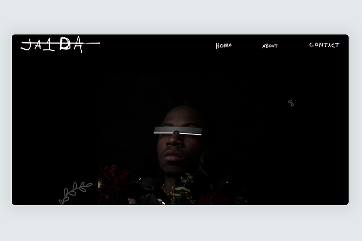
9. Alt-Trap by Ylimay Zavala
Designed by Ylimay Zavala, Alt-Trap is the website of Ja1da, an artist, producer, and songwriter from Savannah, Georgia, whose work we discover through photos and video clips.
The website has a multi-column layout on desktop, which converts to a single column on handheld devices. All visual elements scale proportionally to better fit the available screen estate and the images are slightly resized, yet the focused area remains the same using the focal point tool.
10. Boutique Le Diamant by Félix Duchesneau
Boutique Le Diamant is a cultural center at the heart of the historic city of Quebec. The homepage of this website is full of visual and textual information, but the content doesn’t feel overwhelming because of its zig-zag layout they use on desktop to balance visual elements with text. The relationship between the text and visuals ensure that the user’s eye will travel naturally from one section to another in a Z-pattern.

11. Yulari Films by Ofir Design
Yulari Films is a documentary film company with a focus on social issues. The typography in this website, created by Ofir Design, uses the modern and easily legible Futura sans-serif for both headings and body copy. Media coverage of the company’s films is displayed using the more traditional Garamond serif, adding credibility to the reviews. The site utilizes a two-column zig-zag layout for desktop that turns into a single column on mobile, making it easier for visitors to navigate and consume information.

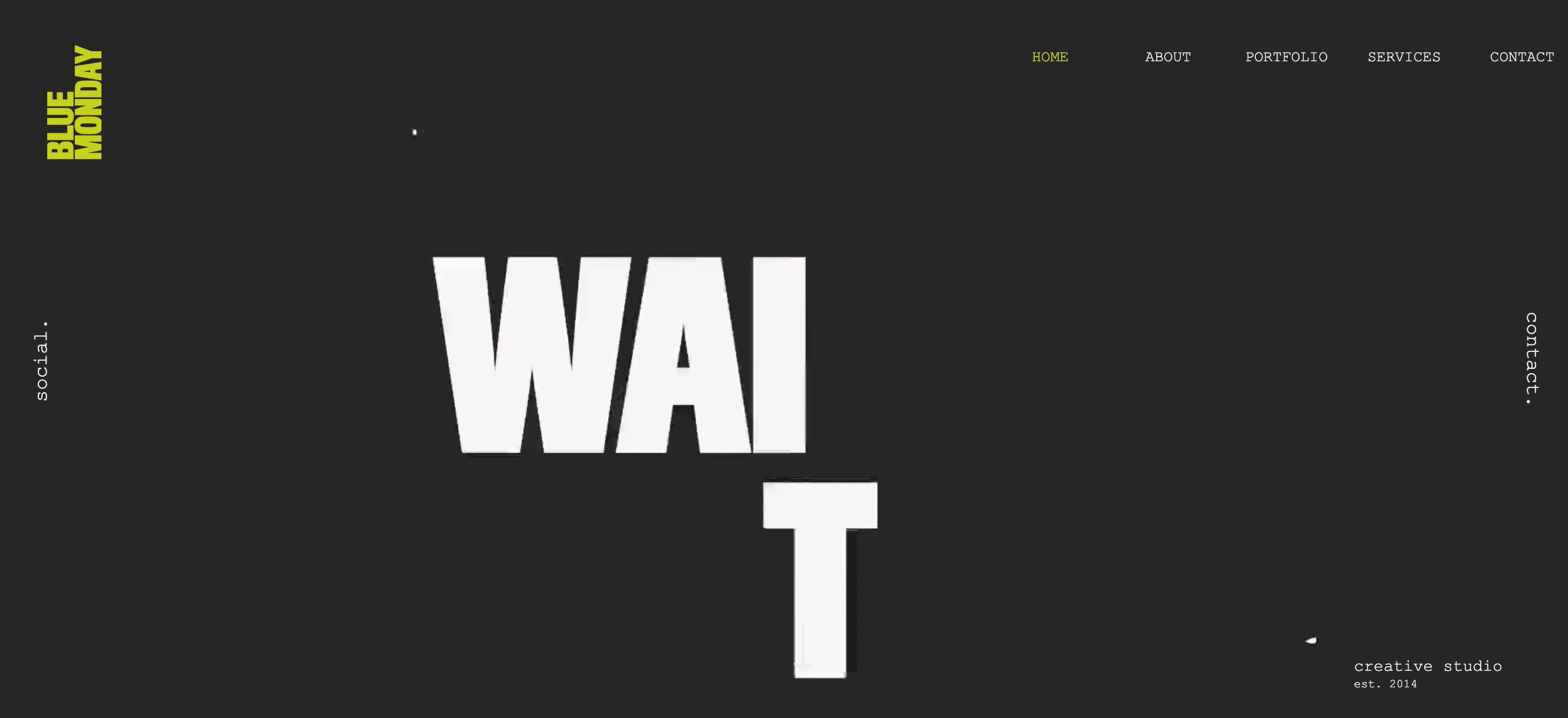
12. Blue Monday by Blue Monday
Blue Monday is a creative studio telling stories through digital film and video production. Their website is bright, loud, and energetic, full of illustrations, video clips, and interesting statistics.
Blue Monday’s vivid color palette is balanced out by a dark gray background and white typography, that together, help ground the poppy visuals in a reliable, professional environment. The great thing about this design is that all visual effects work equally well on desktop and mobile screens. Designing a nice parallax effect on mobile can be challenging, but Blue Monday implements a parallax transition that’s smooth on both mediums.
13. Urban Umbrella by Piranha NYC
Urban Umbrella is a sidewalk scaffolding company. The website, designed by Piranha NYC, welcomes you with a captivating hero video that immediately draws visitors in.
As you scroll down the homepage, you’ll notice a masonry grid of cards that proudly display the sidewalks they’ve designed. The caption is always positioned at the center of the card no matter the screen size, due to their use of the Wix Studio docking feature, which docks an object to the closest edges of its container.

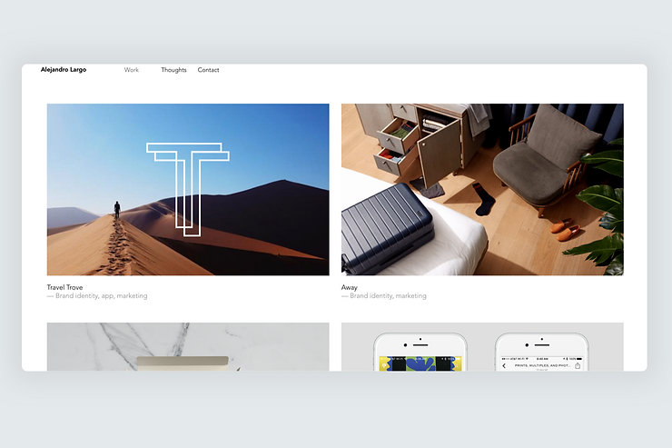
14. Alejandro Largo by Alejandro Largo
Alejandro Largo is a U.S.-based creative director. His work page features a two-column layout and a vertical header menu on the desktop, with ample amounts of white space. On mobile, the page uses a single-column layout and switches to a hamburger icon, achieving the same results with a more streamlined organizing structure.
15. Urban Solace
Urban Solace is a development company with projects in Brisbane and broader South East Queensland. Imagery takes central stage on this website. Visitors are welcomed with a background video that communicates the idea of Urban Solace. High-quality real estate photos showcasing the company’s portfolio appear once the user starts to scroll. The website uses a relatively simple layout with a limited number of columns that scales well on every screen size and resolution.

16. Startup Starter
StartupStarter is a media platform dedicated to entrepreneurship. Although the website provides a lot of information to visitors, it is organized in clusters, making it easier for users to scan and comprehend it. This approach also works well for responsive design—it’s easy to optimize the layout to different mediums when content is organized in individual blocks.

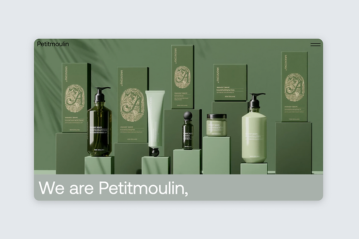
17. Petitmoulin Studio
Petitmoulin is a French contemporary design studio that works on branding projects. The studio’s website showcases the studio’s most notable projects. The website uses a relatively simple two-column layout, but it effectively incorporates a lot of visual effects—from parallax scrolling to on-mouse-hover animated transitions for images, that introduces a dynamism in interaction and makes the websites more memorable for visitors.
18. HYD Studio
HYD Studio is a brand & design boutique for high-end beauty and fashion clients. The website utilizes the style of printed glossy magazines (fine imagery paired with crisp typography) to convey an impression of luxurious design. When it comes to layout design, these web designers effectively utilized all available screen estate with a three-column layout on desktop and a one-column layout on mobile.

19. Aad & Nief
Aad & Nief is a concept store in the heart of Diest, a Belgian city. A store’s interior helps visitors immerse themselves in a world of handmade, vintage, and local products. The site follows the same approach for web visitors—it utilizes a lot of white space to focus visitors’ attention on photos of products.

20. Desa Studio
Desa is a design studio that offers end-to-end branding solutions for companies. The site lets the work created by the agency speak for itself by trimming all visual decorative details to an absolute minimum and putting the studio’s works front and center. Typography plays a vital role in communicating the meaning of this website—it utilizes fine typography for sections that describe what the studio does.
