
Download this image from Canva’s photo library
Web design is a highly individual process. In order to create truly unique and impactful compositions, designers must let go of their preconceived ideas of what a website should look like. Instead, they must let their brand values, audience, and point of difference be their ‘true north’, guiding them through the design process.
But while the design is all about breaking the ‘rules and creating your own, there are a few failsafe web design principles all designers should keep in mind. These tried-and-tested guidelines are essential for creating polished and functional websites that engage your audience. Read on for 20 essential web design principles to inform your next creations.
01. Use readable and web-friendly fonts
The role of typography in web design can’t be understated. Using the right fonts exemplifies your brand personality and immediately grabs your audience’s attention. However, it’s not just about looking good. The typefaces you use in your web design also need to be functional and readable. After all, if the user has to squint just to see your text, they’re likely going to struggle to connect with your message. Arial, Helvetica, Times New Roman, and Courier New are all examples of web-friendly fonts. This means they maintain legibility at any size and work well across both mobile and desktop.
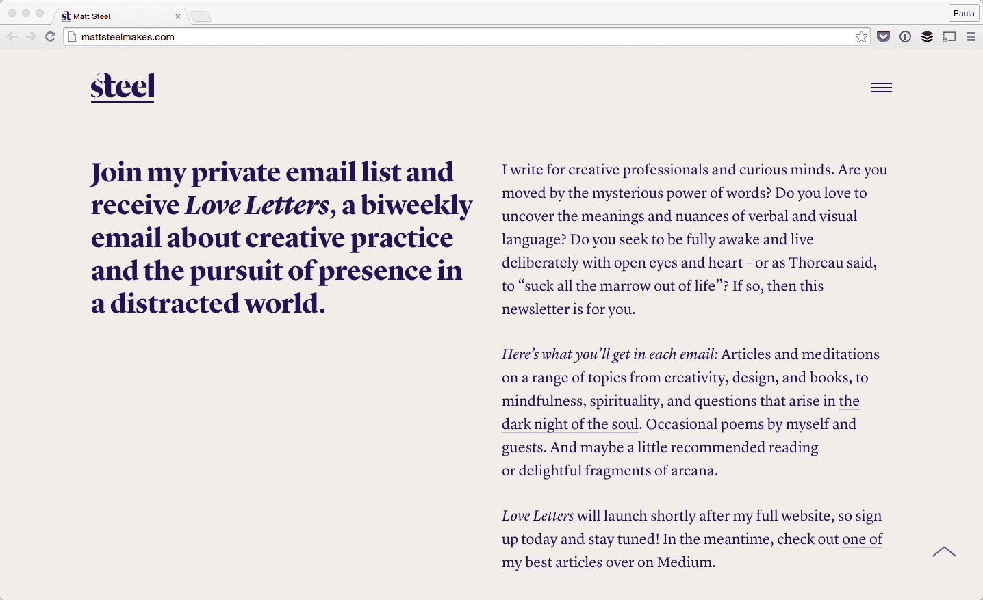
Typography takes centre stage in this website design for writer and designer Matt Steel. He has used a versatile serif font that remains eye-catching when used small and lightweight, or big and bold.
Want to let your typography do the talking in your next web design project? Canva’s Red Geometric Shapes Sale Website Ad template provides the perfect starting point for a text-focused website header.

02. Utilise the ‘F’ pattern
Humans are creatures of habit—and the way we consume content is no exception. A Nielsen Norman Group study into eye-tracking revealed that when we scan the information on a website, the majority of us do so in an F-shaped pattern. This means we first read important headlines along the top of the page, then scan down the left side of the page at any numerals, bullet points or sidebars, then across the page again at any bolded text or sub-headings. In web design, using an ‘F’ pattern involves mimicking the eye’s natural path so as to not disrupt the visual flow. This is especially important on the landing and sales pages, where conversion is the ultimate goal.

You can see this in action on BigCommerce’s homepage. They have expertly crafted an F-shaped layout to prompt the user to take the desired action—which in this case, is taking the product tour. The eyes go straight to the header (aided by the bold typography and colorful underline) then across to the diagram that demonstrates how their product works, then back down to the supplementary info and call-to-action.
03. Or the ‘Z’ pattern
While the ‘F’ pattern is a common eye-scanning pattern, it’s not the only one. The ‘Z’ layout is another important design principle. This is when the eye scans from left to the top right, forming an imaginary horizontal line. Them, it goes down to the left side of the page, creating an imaginary diagonal line. Lastly, it trails back across to the right again, forming a second horizontal line.
So, when would you use a ‘Z’ layout over an ‘F’ one? While the ‘Z’ layout tends to perform best for landing pages, the Z-pattern is generally better suited for pages with very minimal information where the main takeaway is the call-to-action.
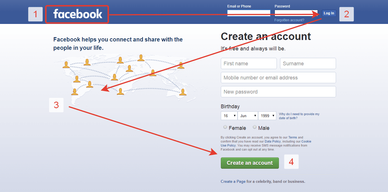
Chances are, you’ve seen this pattern in action before—because it’s used on the login page for Facebook! The eye naturally goes directly to the logo, but the Z pattern guides the users through the two calls-to-action—signing in or joining up.
04. Use negative space
Sometimes, you can turn a negative into a positive! This is certainly the case with using negative space in your website design. Also known as blank space or white space, this is the empty areas between the visual elements in your design (for example, the photos, text and icons)
This principle has been around as long as art itself, but it plays a particularly important role in web design. Overly cluttered and complex websites tend to overwhelm your user and prevent them from taking action—which is the exact opposite of what you want! Meanwhile, using negative space draws their attention to the most important content, increases text readability and creates a seamless user experience.
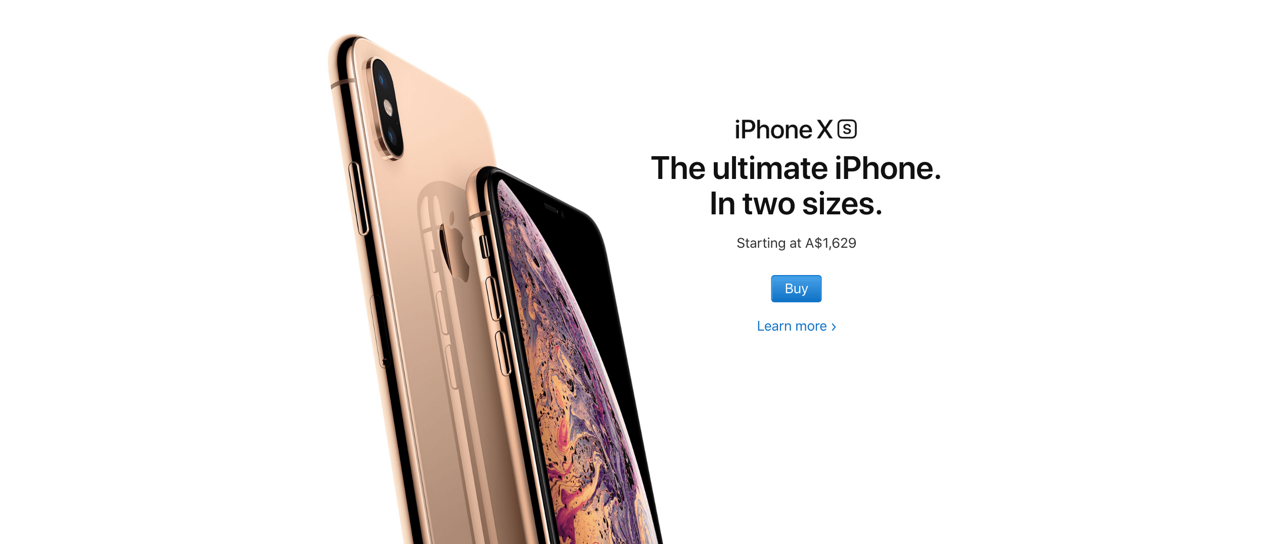
You can see that working here. Apple’s focus has always been on their products, as they don’t need to rely on bells and whistles to sell to their audience. This is reflected in their use of negative space in this minimalistic layout, where they keep the spotlight on their new product—the iPhone X.
Want to incorporate this ‘less-is-more approach into your own web design? Try using a Canva template like the Pink Flower Wedding Events Website, which already has plenty of negative space built into it.

05. Keep your design consistent
You already know that consistency is key in web design. But it’s important to note that this means more than just keeping your fonts, colors and icons uniform across your branding. It also means keeping the spacing consistent in your layouts, too. This helps give your website a polished and professional feel, which boosts brand credibility.
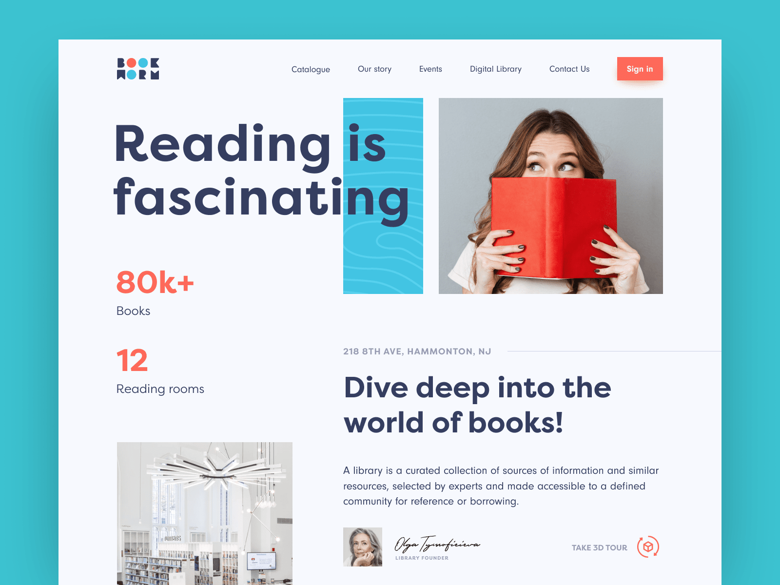
This is evident in this website design for electronic library company, Bookworm. While they have used a range of different font sizes and different image dimensions, the spacing between the different visual elements remains consistent. This helps to create a sense of order and harmony in an otherwise busy composition.
Canva’s built-in alignment features make it easy to make sure your text and paragraph spacing is consistent in your design.
06. Simple and logical page navigation
A website without clear navigation is like a maze without a map. It makes perusing your website unnecessarily difficult and confusing for your visitors. On the other hand, a well-designed website navigation makes for a streamlined and relaxing user experience. This can take many forms—whether it’s a drop-down menu, sidebar or sticky navigation. The key is that it’s easy to locate, works well across all devices and isn’t overloaded with different options.
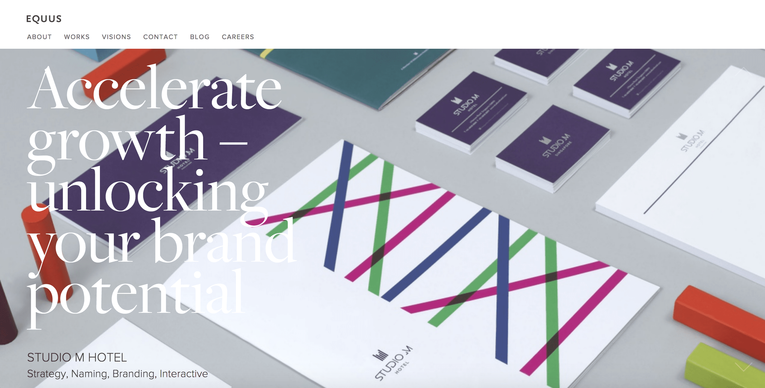
In this example from web design company Equus, the navigation is simple yet effective. They have opted for a monochrome menu bar with a clean, sans-serif font, which stands out against the colorful header. They have also kept their menu options to one word, which helps creates consistency and ensure it doesn’t take up too much space.
07. Use a complementary color palette
The color palette you use sets the mood of your web design. For example, using lots of dark browns and blacks can create a rustic, moody feel, while pastel colors can look quite playful and modern. Whatever vibe you go for, it’s important to make sure the colors you use work well together. Sometimes, this means sticking to similar shades but opposites can also attract (for example, orange and teal) Whether you go for colors that are opposite or next to each other on the color wheel, they need to be complementary.
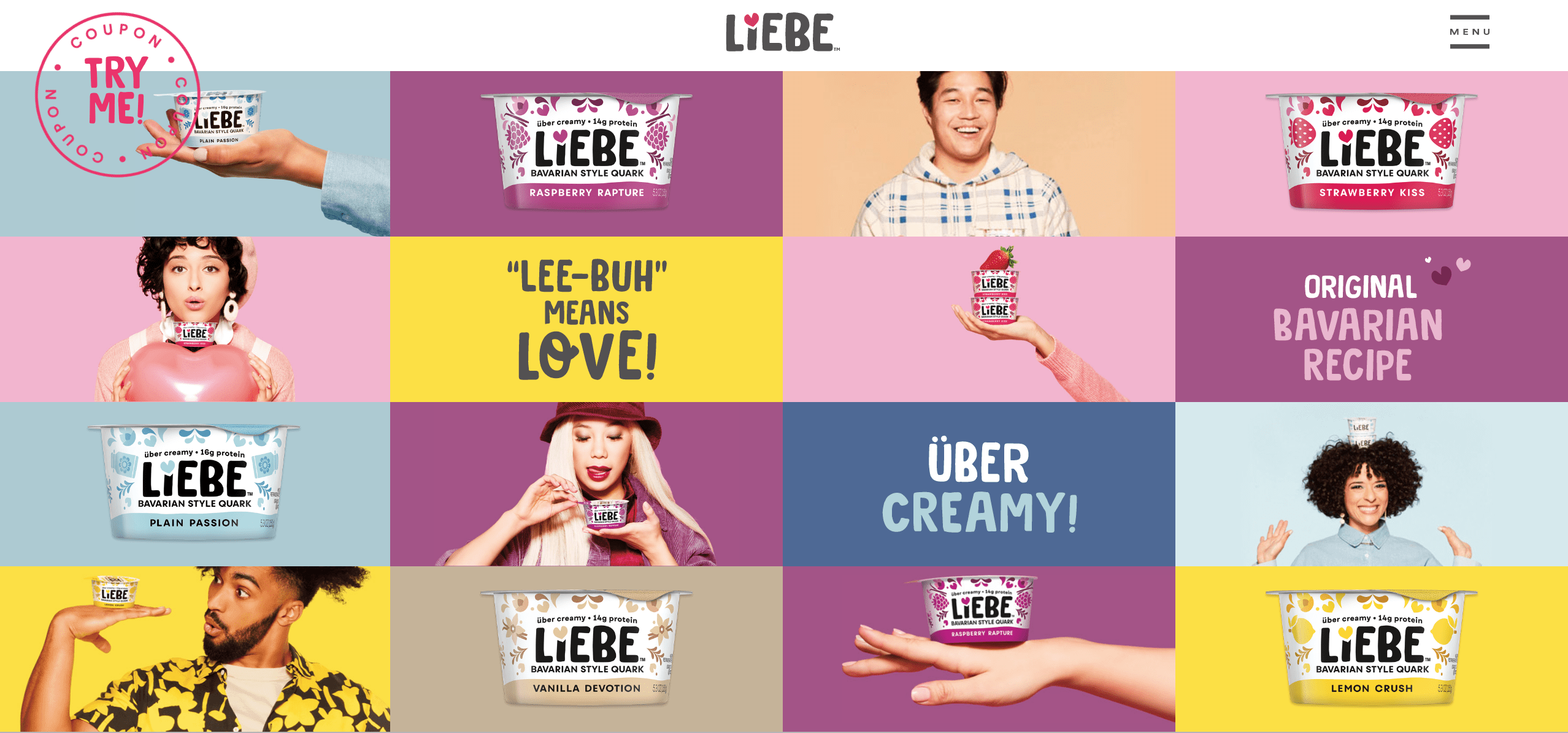
You can use many different colors and still create a visually appealing website, as evident in this web design for yoghurt company Liebe Quark. They have used a combination of warm and cool, light and dark colors to create a contrasting and eye-catching header. The chequered, grid design prevents it from looking too chaotic, while using little pops of the colors across the tiles helps to tie it all together.
Prefer to keep your color scheme simple? The Blue Fashion Blogger template in Canva is perfect for customizing with two of your own complementary brand colors.

08. Keep the audience in mind
Good designers know that it’s not just about creating a website that they think looks good. To really create a website that cuts through the noise online, they must speak directly to their audience through design. Put yourself in your audience’s shoes and ask yourself what their biggest needs, desires, and fears are. This should dictate your design choices, from the fonts and colors you use, to your button text and website navigation.
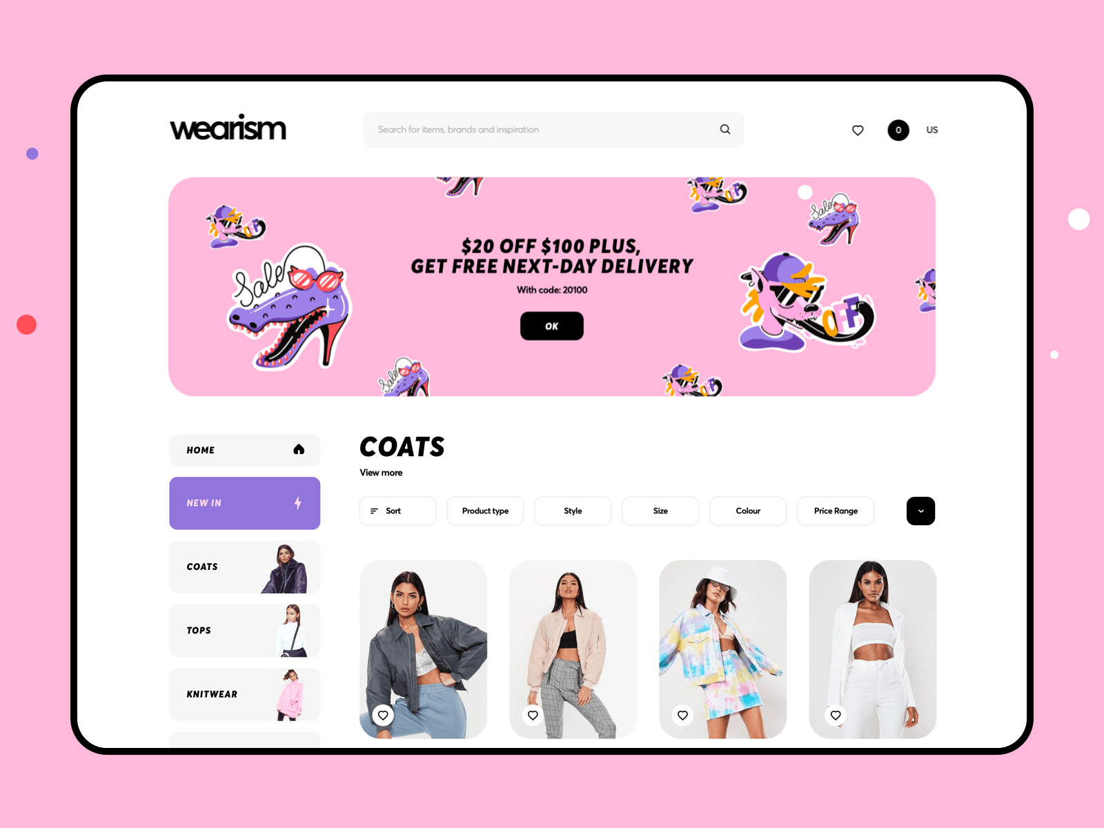
In this concept for a young women’s online fashion boutique, the designer has clearly designed the target audience in mind. The bright and feminine color scheme, iconography and bold bubbly text all work together to create a fun and modern feel that is likely to appeal to teen girls.
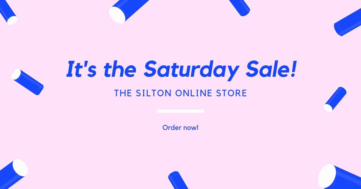
Want to achieve a similar aesthetic for your own website design? The Pink And Blue Rad Facebook Ad Template in Canva is an excellent jumping off point for you to personalize with your own branding.
09. Optimize buttons and calls-to-action
While buttons are often the last thing to be added to a web design, they play an indispensable role. They can be the deciding factor as to whether the user continues to navigate your website or closes the window. The buttons on your website should shout, not whisper. That is, they should stand out against the other visual elements on the page and be easy to find and click.
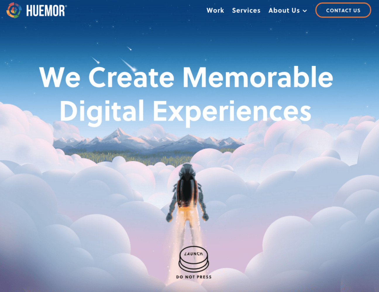
This website from design studio Huemor is a great example of how creative use of buttons can really elevate your overall website. The use of illustration and cheeky reverse psychology in their call-to-action ‘launch, do not press’ works together to create a truly memorable user experience.
10. Maintain a visual hierarchy
We touched on visual hierarchy when we mentioned eye-scanning patterns and navigation. However, it’s such an important principle that it deserves a point of its own! While website design should be aesthetically-pleasing and innovative, it also needs to be logical. That is, you need to deliberately structure your content in a way that makes sense to the user—even if it’s only on a subconscious level.

This website for bitcoin mining company CTSO is a great example. The header text is clearly at the top of the designer’s visual hierarchy, followed by the navigation sidebar. However, rather than taking them away from the homepage, this is used to guide them through the various anchor points on the single-page homepage.
11. Pay attention to the details
The big picture is undoubtedly important when it comes to web design. After all, it’s how all the visual elements come together that dictates the overall look and feel of your website. However, it’s important not to overlook the little things. Paying attention to the finer details like your footer icons, text spacing, and micro-interactions really helps to set your website apart.

This website footer for natural cosmetics company Carbon Beauty is an excellent example. Not only does it compliment the brand’s sleek and minimalistic website, but it’s a work of art in itself. They have combined symmetry, lines, buttons and icons to help keep the audience on the page for longer and encourage them to engage with the brand in different ways.
12. Use Fitt’s Law
Coined by psychologist Paul Fitts in 1954, Fitt’s Law states that the amount of time it takes to move to a target directly corresponds with not only its distance but the size of the target, too. Although this theory originally related to the human motor system, it’s now a central principle of UX (user experience) design. Often used in relation to buttons, the idea is that the elements you want to be easily selectable (for example, your primary calls-to-action) should be large and positioned close to users.

You can see this in play with this website for copywriting studio, Very Good Copy. Presuming the user’s cursor will be somewhere near the top of the screen, the designer has placed the large button smack bang in the middle of the screen to encourage them to click. Of course, the fact that the button is bright yellow doesn’t hurt, either!
13. Choose your images wisely
They say a picture paints a thousand words and this is certainly the case in website design. Imagery can serve so many purposes in web design, whether it’s telling a story, demonstrating how a product works, evoking emotion or creating atmosphere. However, it’s important to keep in mind that not all photos are created equal. Be sure to thoughtfully select the photos you use in your web design. They should not only be of professional quality and high resolution, but they should fit your overall aesthetic and have a clear objective.
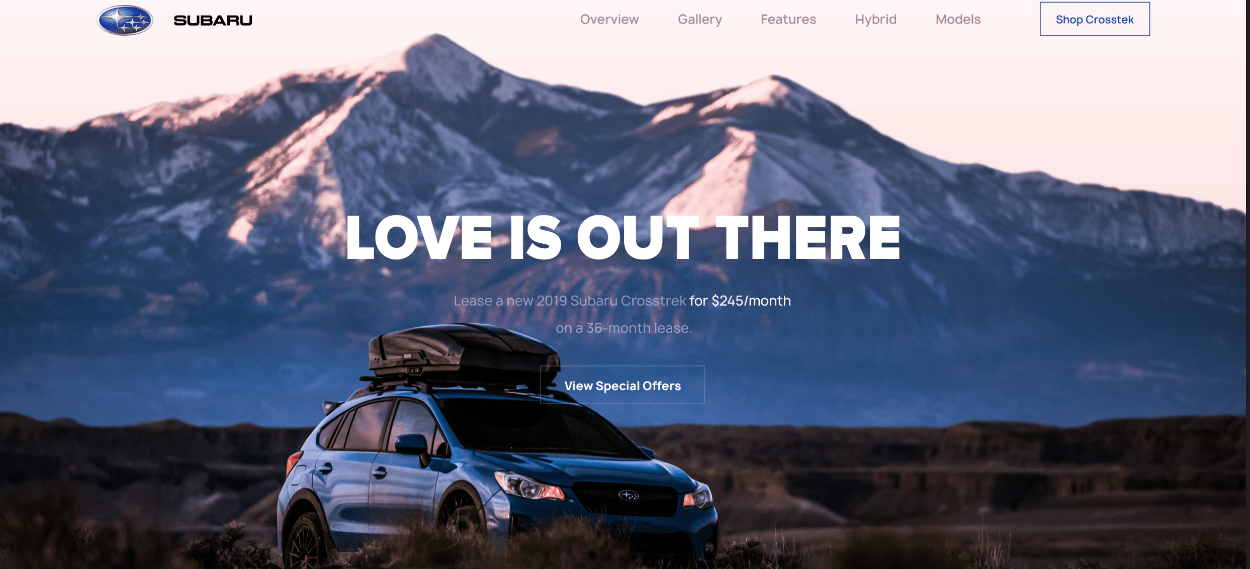
Take, for example, this website design for car company for Subaru. The landscape photography serves a very specific purpose—to evoke a sense of adventure and help the user imagine how they might use their new vehicle. After all—they’re not selling a car, they’re selling a lifestyle! This is far more effective than if they had used a simple product image of the car without context.
Like the idea of using an image background in your website design? Canva’s Jewelry And Accessories Online Store Website template can be easily swapped out with your own imagery. It’s a particularly effective option for businesses or e-commerce brands who want to showcase their products.

14. Prioritize the user experience
User experience isn’t just for UX designers. Anyone who wants their audience to take action on their website (whether it’s subscribing to a mailing list or buying something) should pay attention to the customer journey. The good news is, this doesn’t necessarily have to be a complex or highly technical process. It’s simply about making it as easy as possible for your audience to take the desired steps.
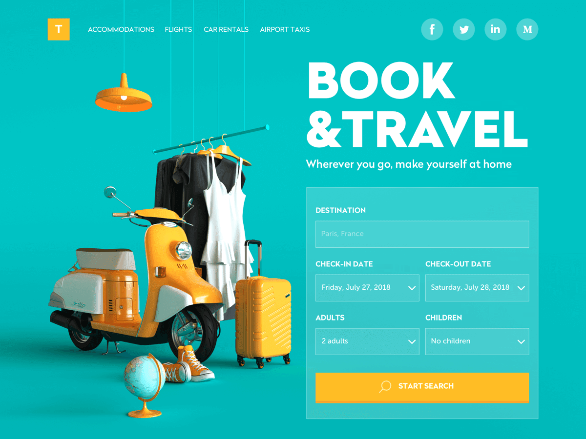
This website for Book & Travel showcases simple UX design at its finest. They know exactly what their audience is there for—to search for and book flights and accommodation—so they have built this functionality straight into their homepage. This isn’t an overly complicated device, but it’s certainly an effective one!
15. Consider using grid systems
Using a grid layout is a foolproof way to make your website look neat, organized and professional. Essentially, these are intersecting horizontal and vertical lines that serve as guides to place and align the elements in your composition. This is a powerful visual tool that creates consistency and order in your design—which can be particularly useful when there’s a lot going on!
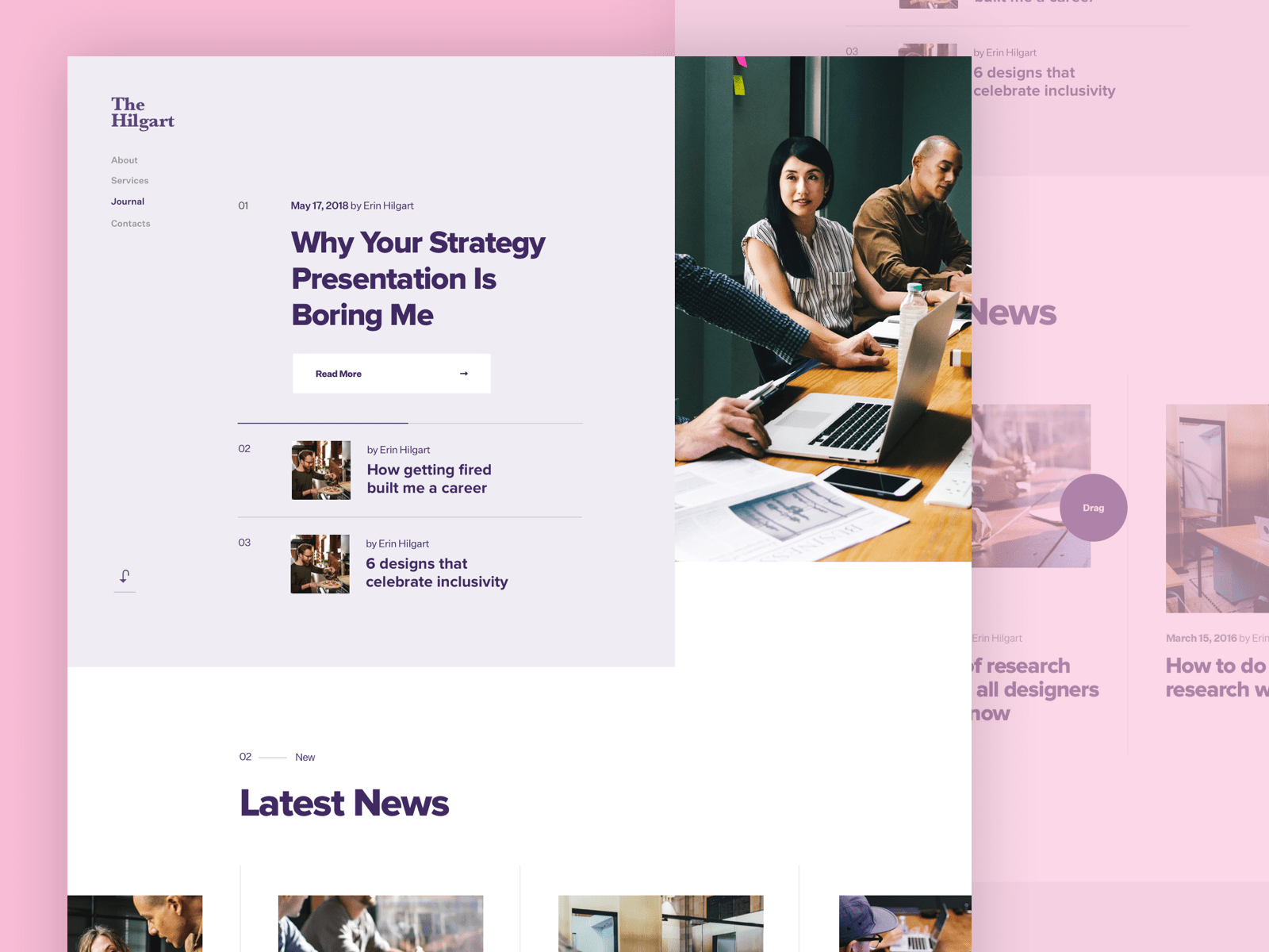
In this blog concept for The Hilgart, designer Ruslan Siiz has used a grid-based layout to form the basis of his layout. While there are some asymmetrical elements and different columns throughout this homepage, this makes it feel tidy and structured.
You can achieve a similar effect with Canva’s Pink Advocacy Portfolio template. Its ready-made grid layout will help you create visual balance in your own website design.
16. Avoid big chunks of text
You only get one chance to make a great first impression on a new website visitor. This is why it’s so important to make your brand offering immediately clear to your audience. While this partly comes down to your copywriting (the written content), your website design plays an important role, too. For this reason, using big chunks of text on your website is a definite no-no— especially on your homepage. Not only can it dilute your brand message, but it can make your website look cluttered and messy.
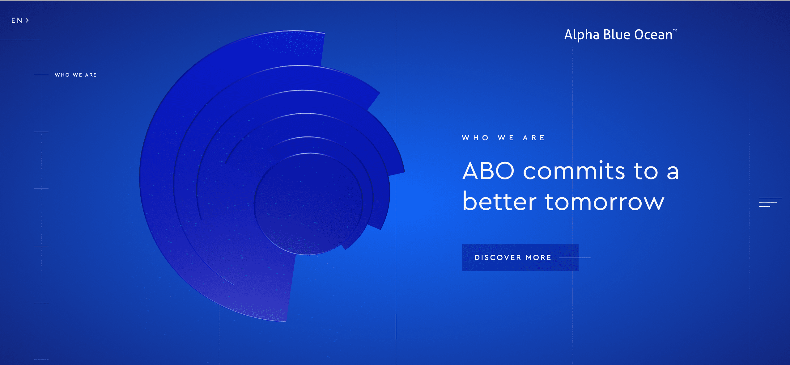
This website for finance company Alpha Blue Ocean shows how that you don’t need a lot of text to make a serious impact. They have immediately showcased their brand purpose in just a few words (using a crisp white typeface that stands out against the vibrant blue background) However, they also give the user the option to reveal more information about them by using the navigation on the left.
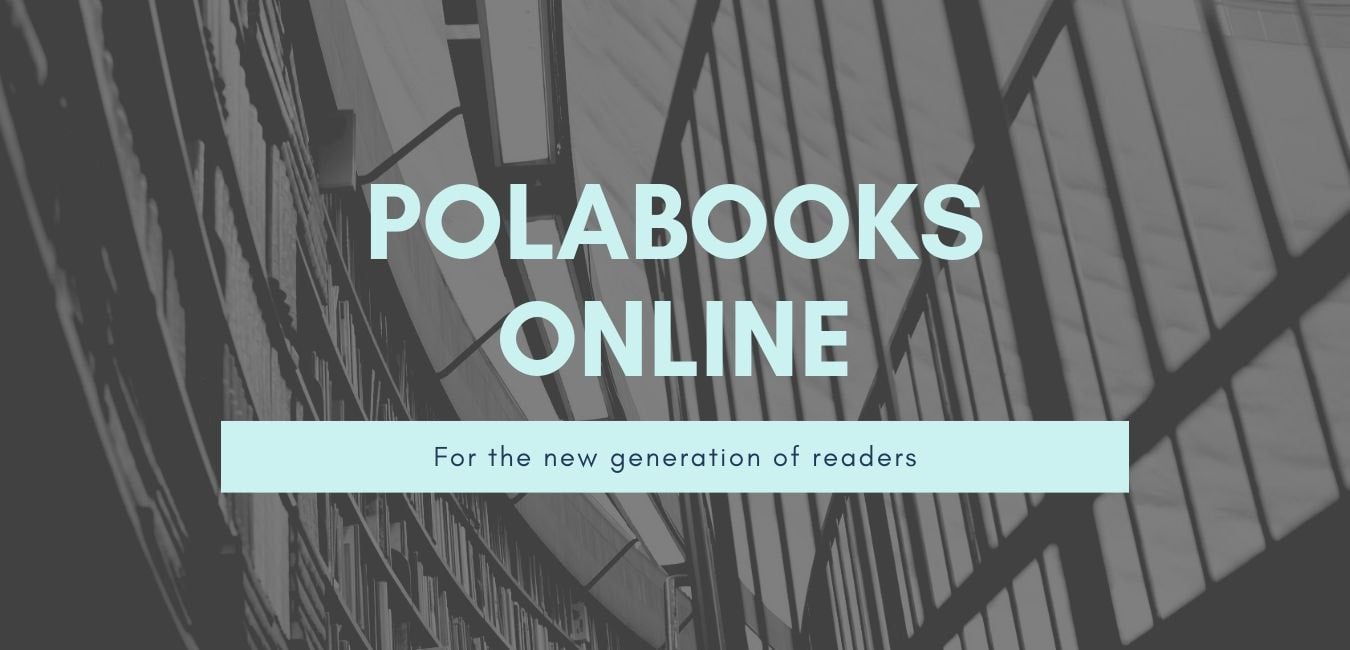
Canva’s Teal Books and Publishers Online Store Website template has all the visual elements you need to simply and effectively communicate your brand message. Simply change out the heading and sub-heading with your own!
17. Use invariance
The principle of invariance is when you put one different option amongst an otherwise homogenous group. This can be an indispensable tool when designing pricing tables on your website.

This pricing table from the Envato website theme Modern Bootstrap 4 is a great example of this principle in action. While most of the options feature a white box with black text and a red button, the coloring is inverted for the ‘corporate’ package. Naturally, the human eye goes straight to the one that is different—which can work in your favor when you’re trying to draw attention to a particular option or special offer! Invariance can also be used in navigation menus, when you’re trying to encourage the user to take a particular action.
18. Hick’s Law
Outside the design world, this principle is generally referred to as ‘decision fatigue.’ Named after British and American psychologists William Edmund Hick and Ray Hyman, it’s the idea that ‘with every additional choice increases the time required to take a decision.‘ So, the more you overload your user with too many different options (whether that’s buttons or menu options) the longer it’s going to take to entice them to take action. And as you generally only have a very narrow window of opportunity to make an impression, this is not a good thing! This is why it’s so important to limit your calls-to-action, and make the ones you do use as effective as possible.
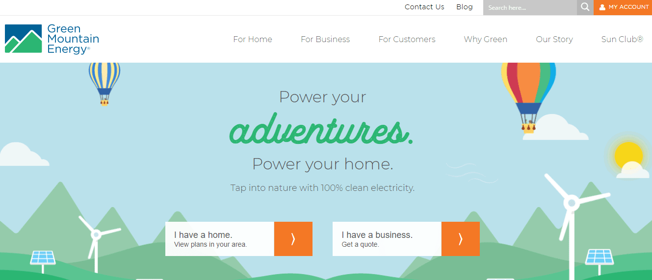
This website for electricity company Green Mountain Energy has clearly been designed with Hick’s Law in mind. The user is given only two main calls-to-action (which clearly stand out, thanks to the orange button) which serve the very important purpose of identifying whether they’re a home or a business. The takeaway? Don’t include more calls-to-action than you absolutely need to.
19. Use symmetry
While there’s a time and place for more abstract, asymmetrical designs, you can’t go wrong with symmetry. Referring to when two halves of a whole perfectly mirror each other, it’s an easy way to immediately make your website design look more balanced, neat and professional.
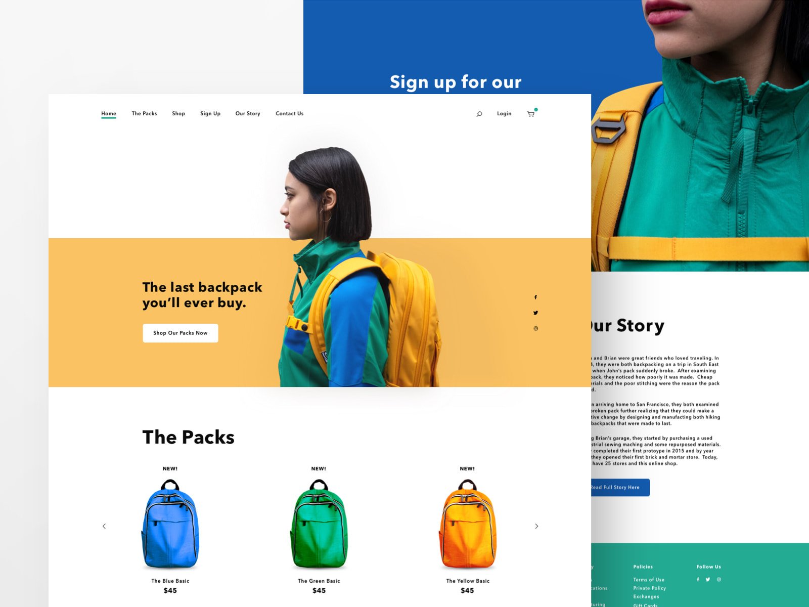
This design concept for a backpack company proves that symmetry doesn’t have to be boring. Designer Gabe Becker has achieved both vertical and horizontal symmetry by placing the image of the girl in the middle of the header. This is mirrored by the perfectly aligned row of bags below. This effective visual technique gives a structured feel to an otherwise vibrant and ‘loud’ design.
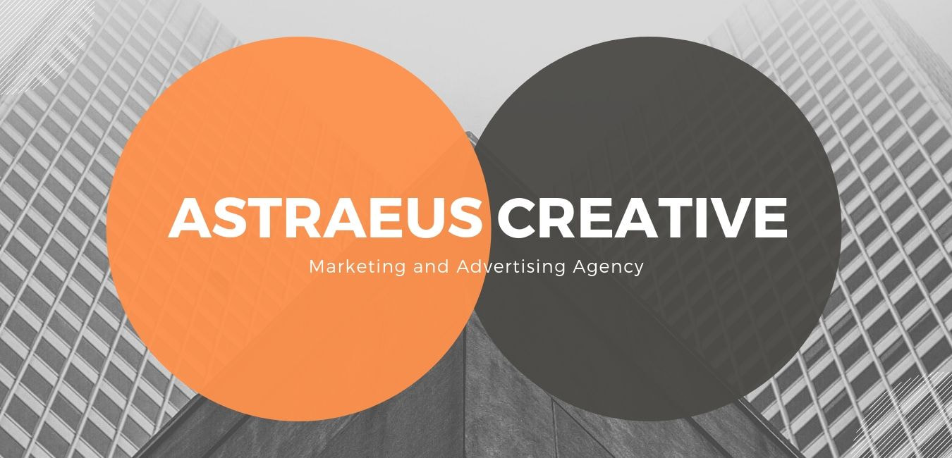
Want to achieve symmetry in your own website design? Canva’s Orange Black Advertising and Marketing Business Website template have done all the heavy lifting for you! All you need to do is add in your brand colors, fonts, and text to make it your own.
20. Design for both web and mobile
If you pay heed to only one website design principle, make it this one! Smartphones aren’t going anywhere—in fact, they’re increasingly becoming the most popular way we consume content. This is why it’s so crucial to design with both desktop and mobile in mind. This means ensuring your headers and paragraphs work well across both devices, that no images or other visual elements have been cut off and that your buttons are easy to use on a small screen. It also involves making sure your website loads quickly on both devices.

Optimizing your website for mobile sometimes mean using different layouts to desktop. You can see this in action in the mobile-friendly version of the above example. Here, they have used a full-screen image and grid-design specifically to enhance the mobile experience. This shows why it’s so crucial to treat design for mobile and web as two separate entities.
Taking these design principles on board doesn’t make you a stickler to the rules. It simply ensures you have a strong foundation down pat, so you can take risks and experiment where it counts.